Case study · My Vodafone app (MVA12)

Vodafone Marketplace

Turning a bill-checking app into somewhere people shop, in 20 markets at once.

Role
Squad lead, senior product designer
Team
4 engineers, 1 PM, 3 designers, 1 researcher, 1 motion designer
Length
4 months, two-week sprints
When
Mid to late 2023
Context

One company, 20 markets, about 30 apps.

52M

active users on My Vodafone (FY23 Q4)

~30

local and utility apps, each market with its own

1

app for every market: the goal of MVA12

The problem

An app people opened once a month to check their bill.

  • Walk-in retail sales down about 30%, while total revenue kept growing.
  • You couldn't buy a phone in the app. Only on the website or in a store.
  • Germany, Portugal and every other market looked and behaved differently.
What we set out to do
  1. Be useful beyond billing. Give people a reason to open the app.
  2. Sell digitally. Measured by new Marketplace revenue.
  3. Build loyalty through rewards. Measured by DAU and session length.
  4. One experience everywhere. Measured by running cost across markets.
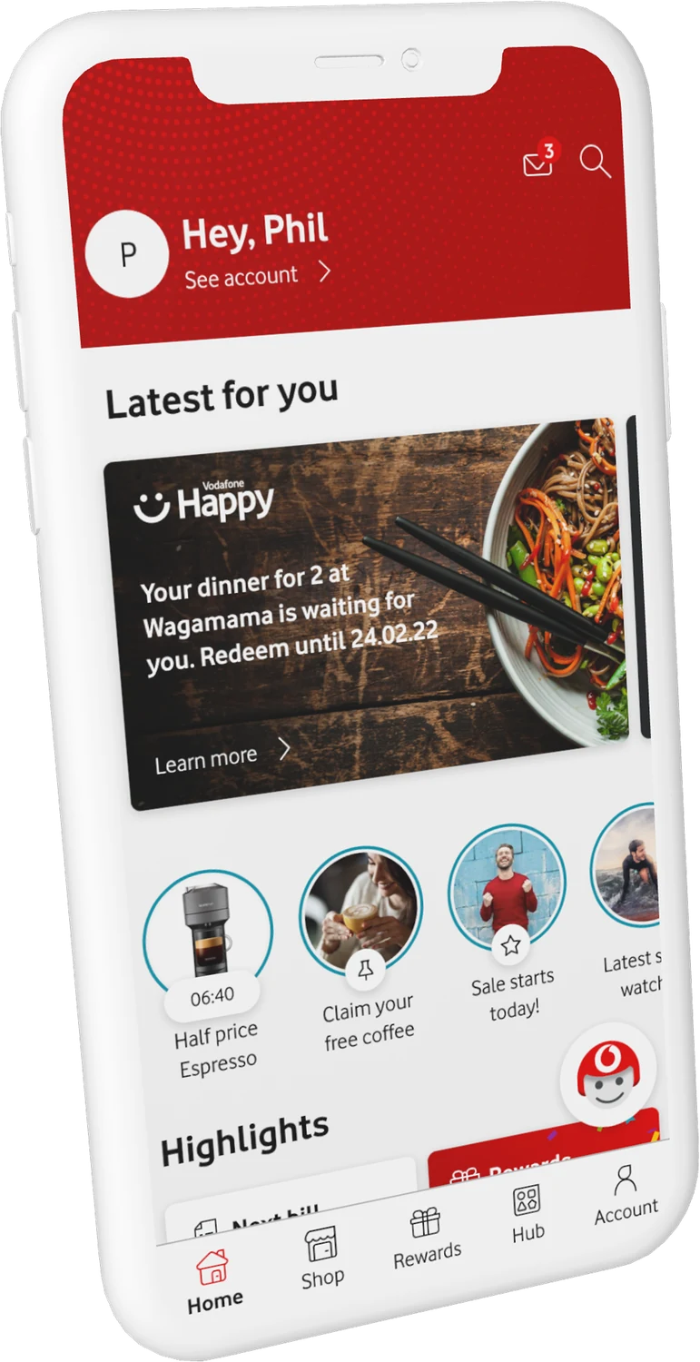
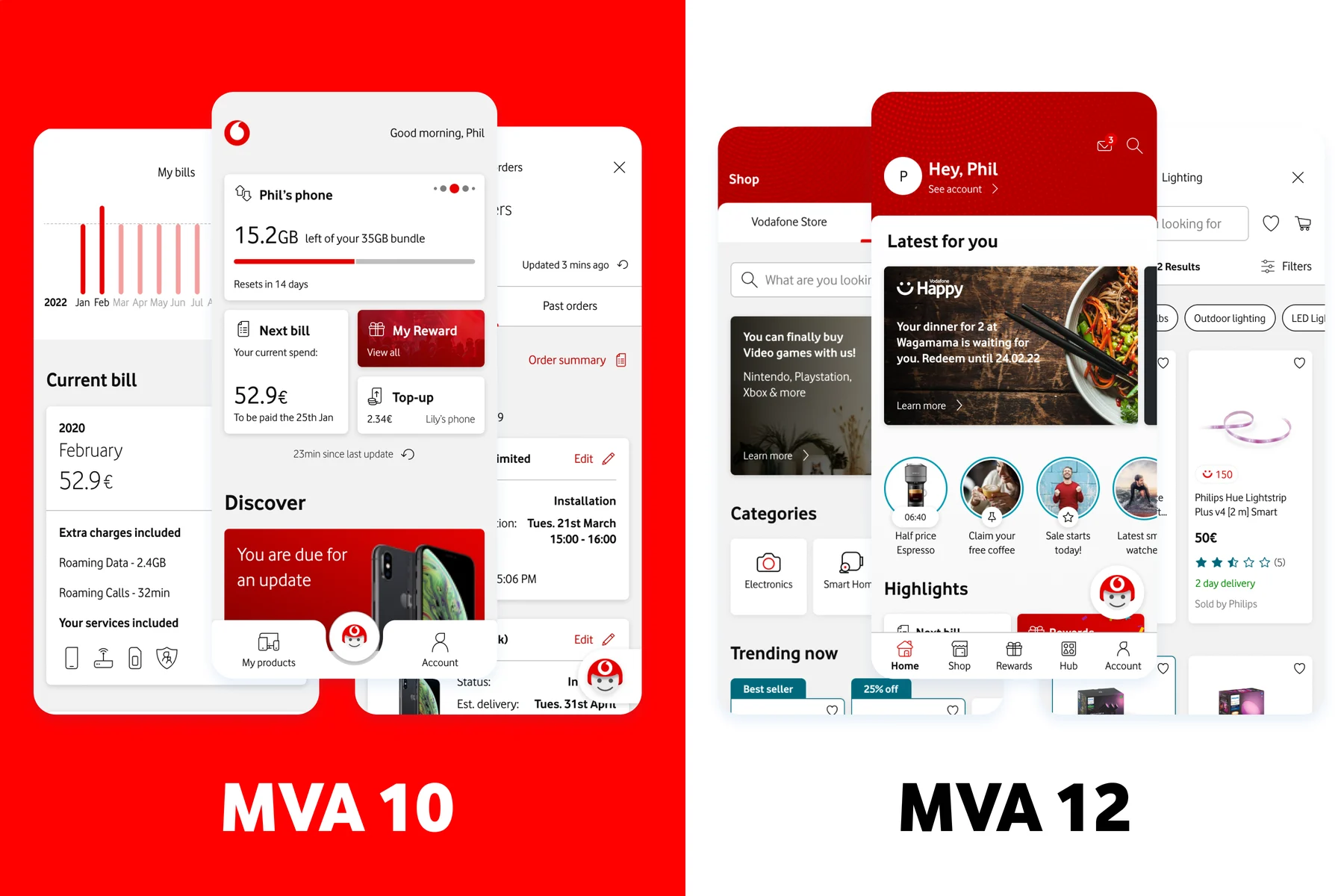
MVA10 and MVA12 side by side
Marketplace

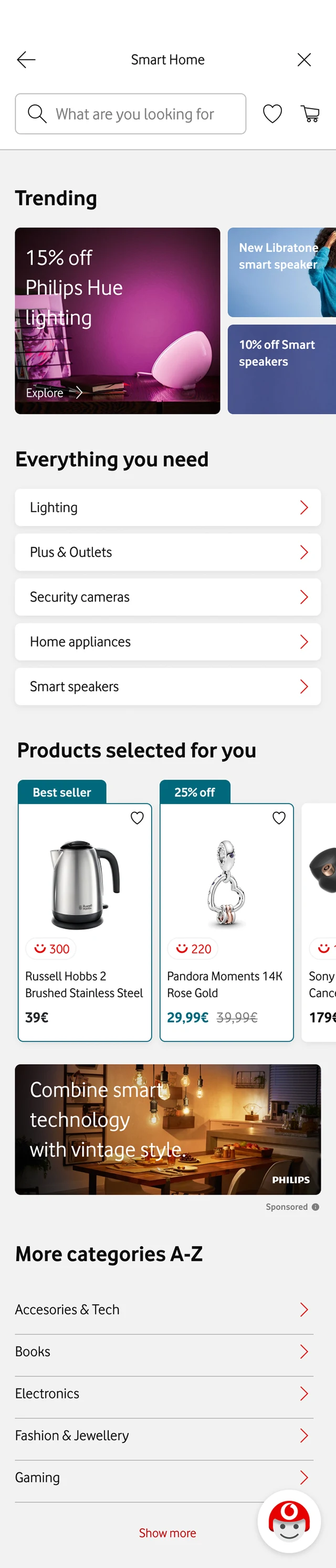
A shop for connected-home and work-from-home tech.

  • Vodafone's own devices beyond phones: GigaCube, TV, Wi-Fi extenders, smart plugs.
  • Partner products from Samsung, Siemens and Philips, sold through Vodafone.
  • Bundled with data, like a GPS bike light with its own SIM.
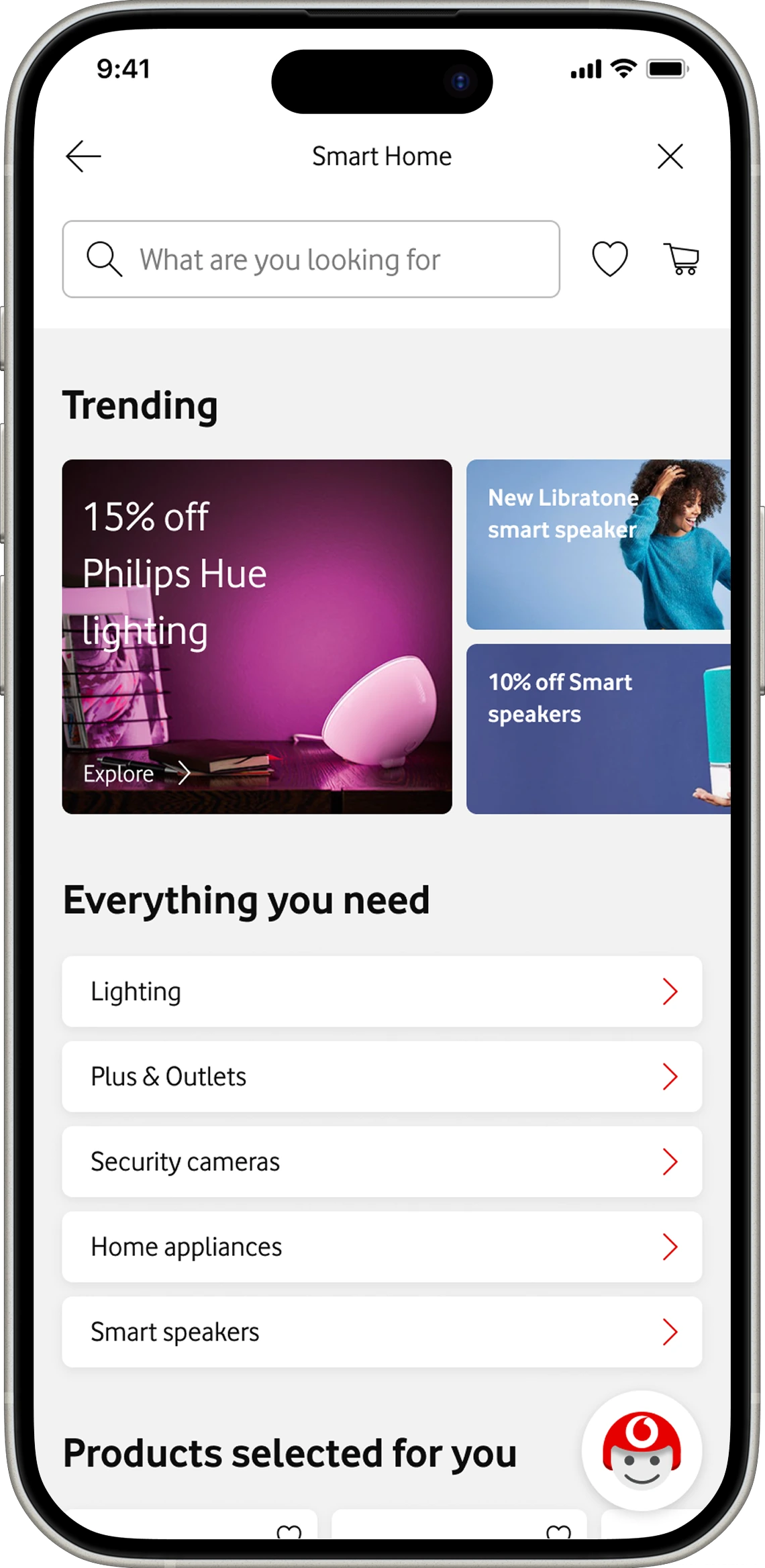
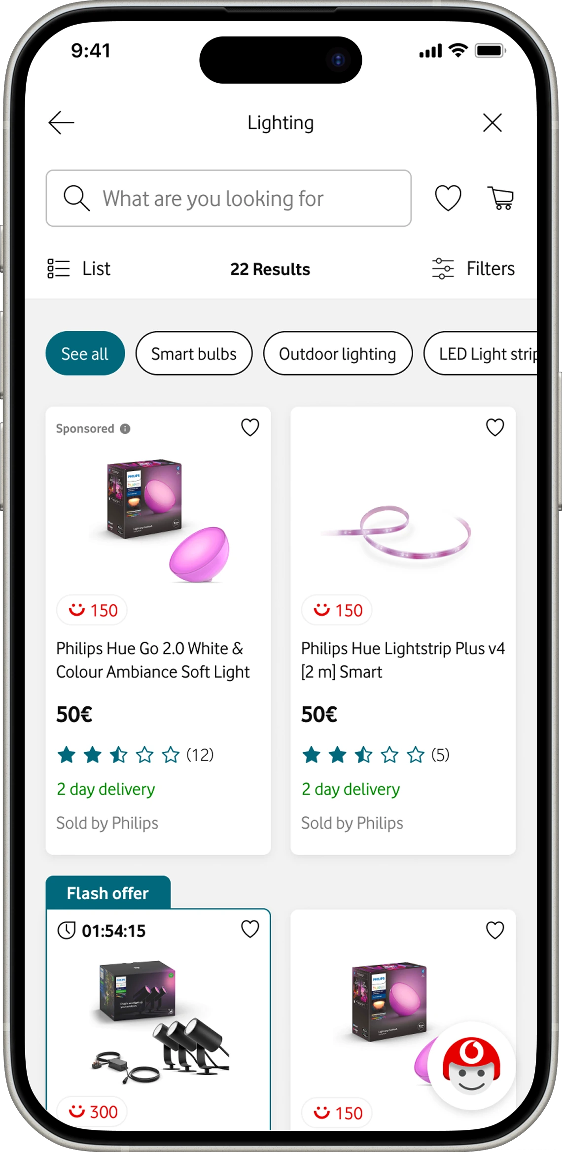
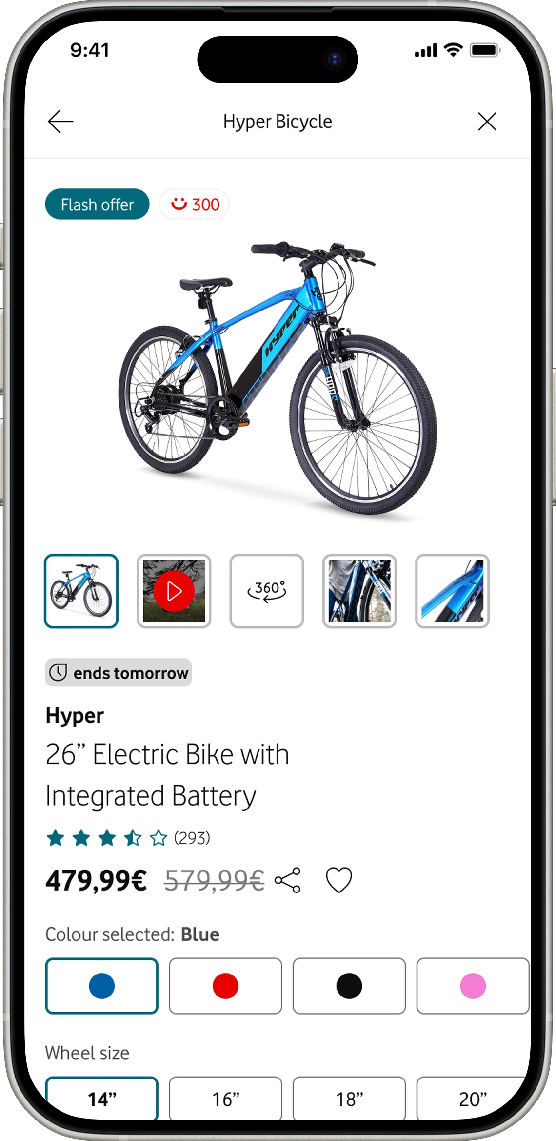
Marketplace home Marketplace category list Marketplace product page
Before the screens

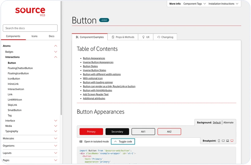
The next screens were built on Source.

Source was Vodafone's design system from 2016 to 2024. Judge the decisions on the next few slides.

For visual craft, judge Unity, the system that replaced it.
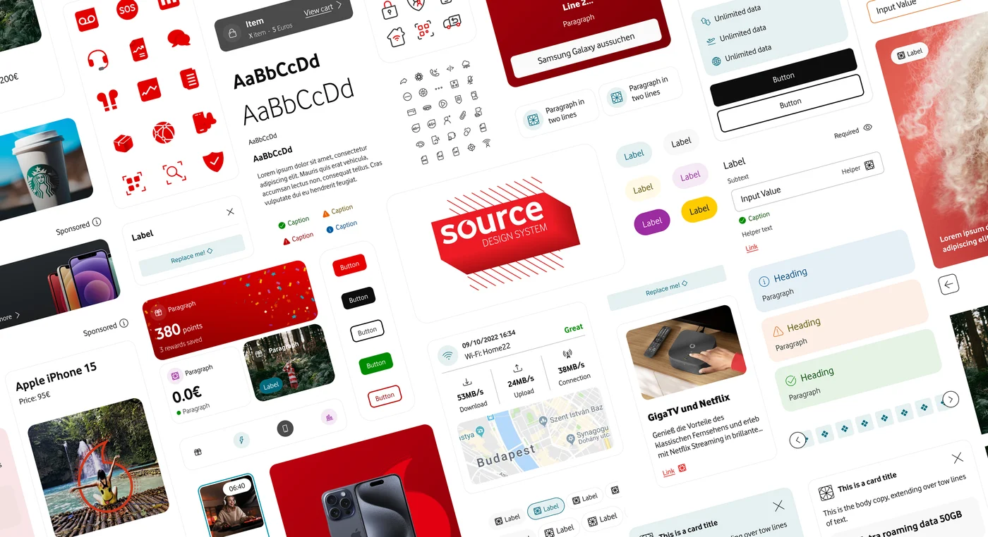
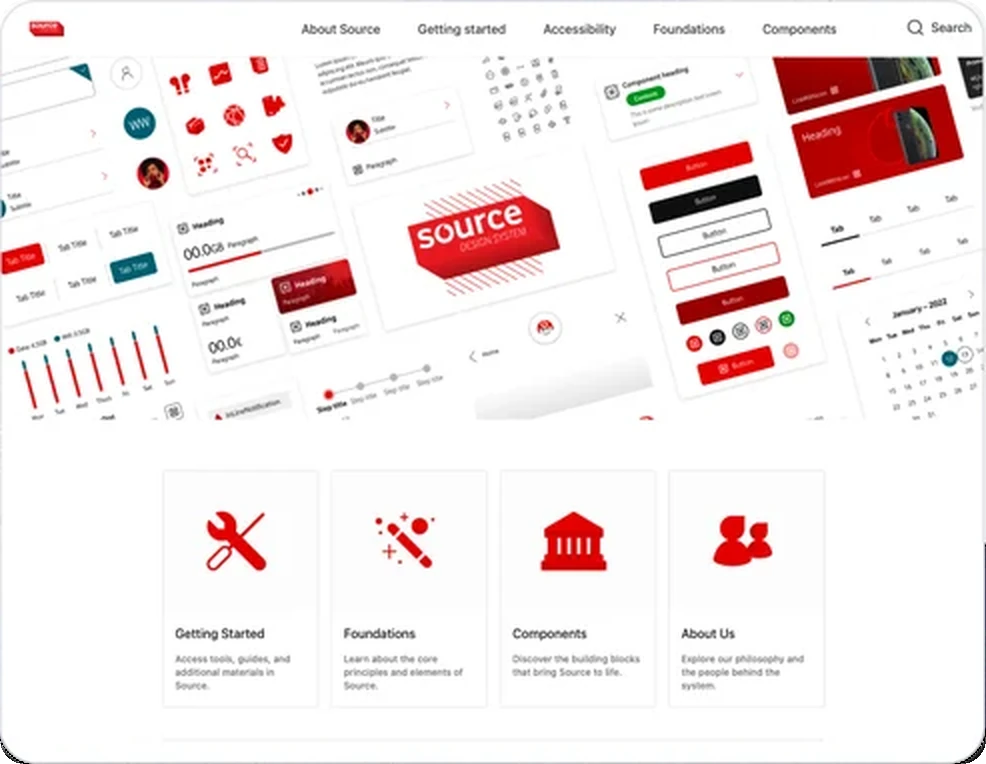
The Source design system
Source2016–2024
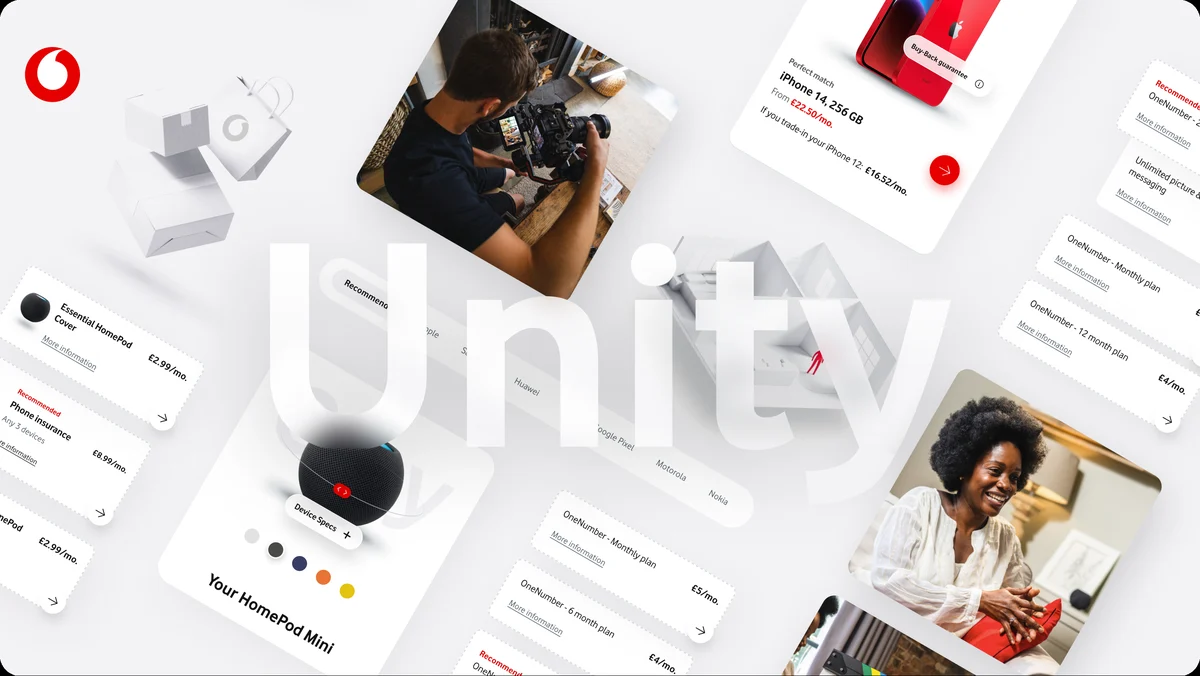
The Unity design system
Unity2024–Now
Decision 01 · Catalogue

Should Vodafone and partner products feel like one shop?

The brief asked for a seamless marketplace. The team leaned towards one merged catalogue. My worry: when a partner's order is late, people blame Vodafone.


We tested both. In the merged version, people assumed Vodafone sold and supported everything, and were surprised when told otherwise.
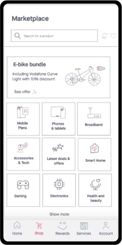
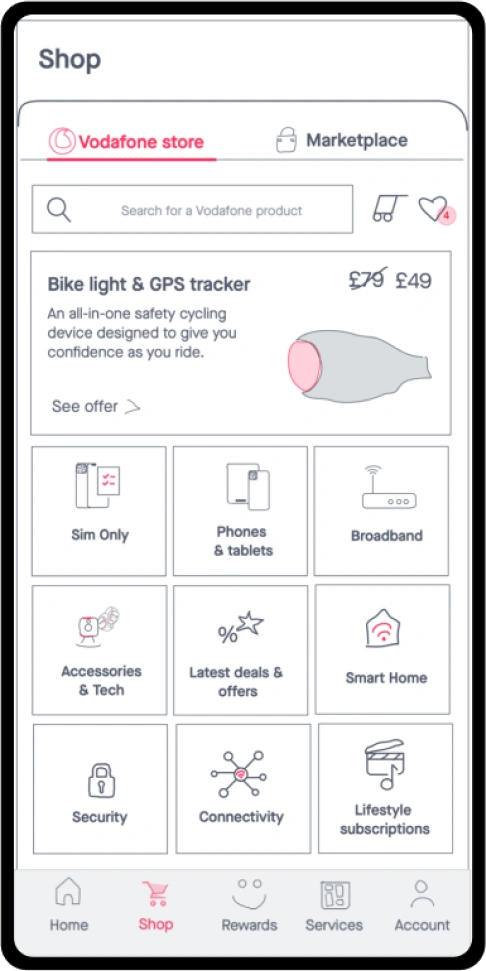
We kept two stores behind one entry point. Clarity built more trust than seamlessness.
Merged catalogue concept
Separate Vodafone store and Marketplace tabs
Decision 02 · Checkout

One checkout, and a different payment rulebook in every market.

We wanted save for later: add your card, decide later.

But whether you can store a card before a purchase depends on the market. One flow had to work in all of them.

One shared journey. Card storage decided per market.
Basket
Delivery
Payment
Save the card after purchase
Save the card during checkout
Confirmation
Decision 03 · Basket

I argued against upsell. Testing proved me wrong.

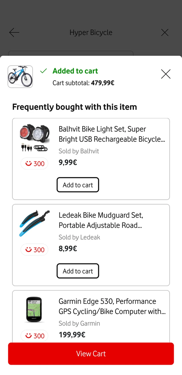
After adding to basket, the team wanted a You might also like sheet. I thought our catalogue was too small and it would feel pushy.

In a rapid test, people liked it and didn't find it salesy. We shipped it with one rule: the sheet only appears when there's something genuinely related.
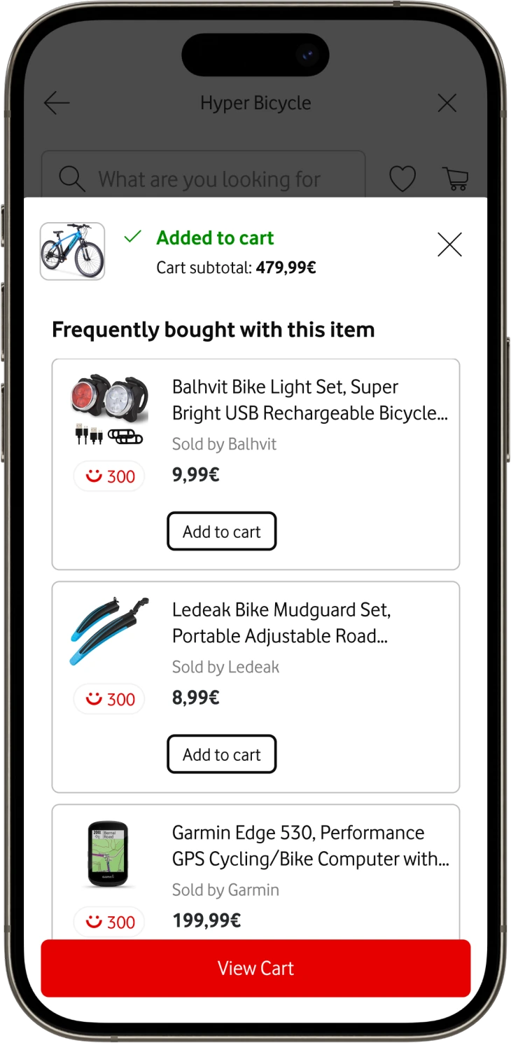
Added to cart sheet with frequently bought items
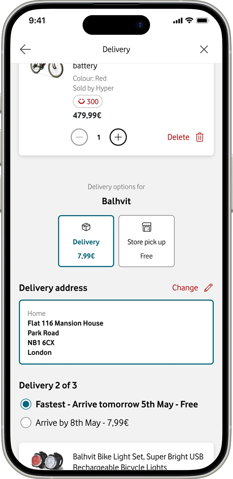
Decision 04 · Delivery

We offered flexibility nobody wanted.

Workshops gave every item its own delivery method: home, one of ~400 stores, or a pickup point.

4/12

people couldn't finish the delivery step in testing.

They expected one choice for the whole order. Some picked options for the wrong item.
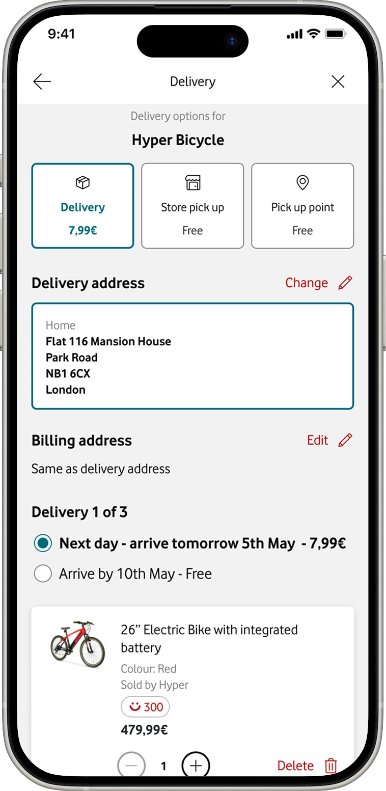
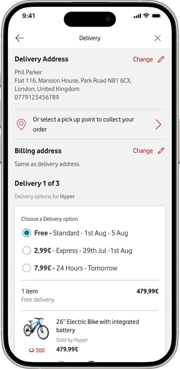
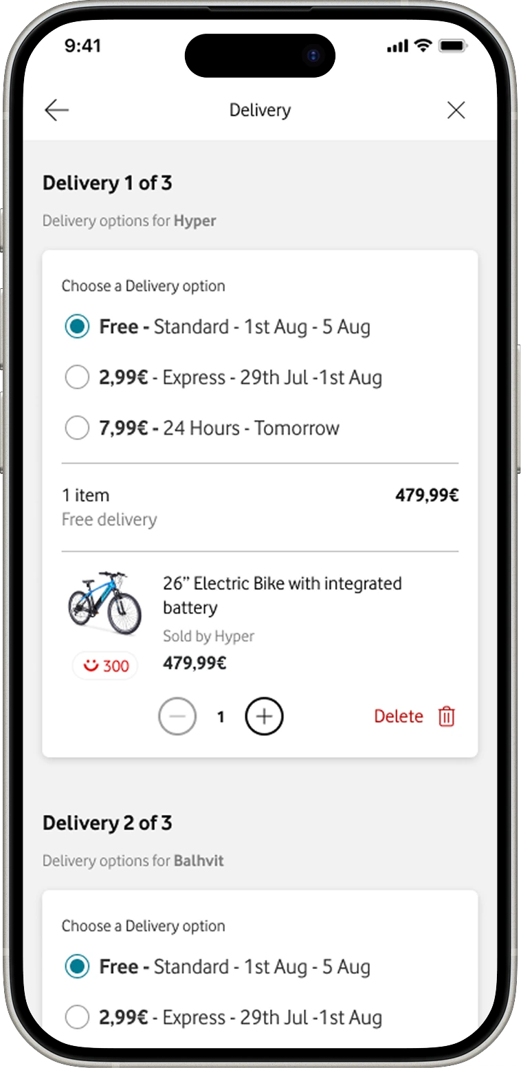
One delivery method per order. Retested with the same people: understood straight away.
Per-item delivery choicePer-item delivery choice, scrolled
One delivery method for the orderDelivery options for the whole order
Edge cases

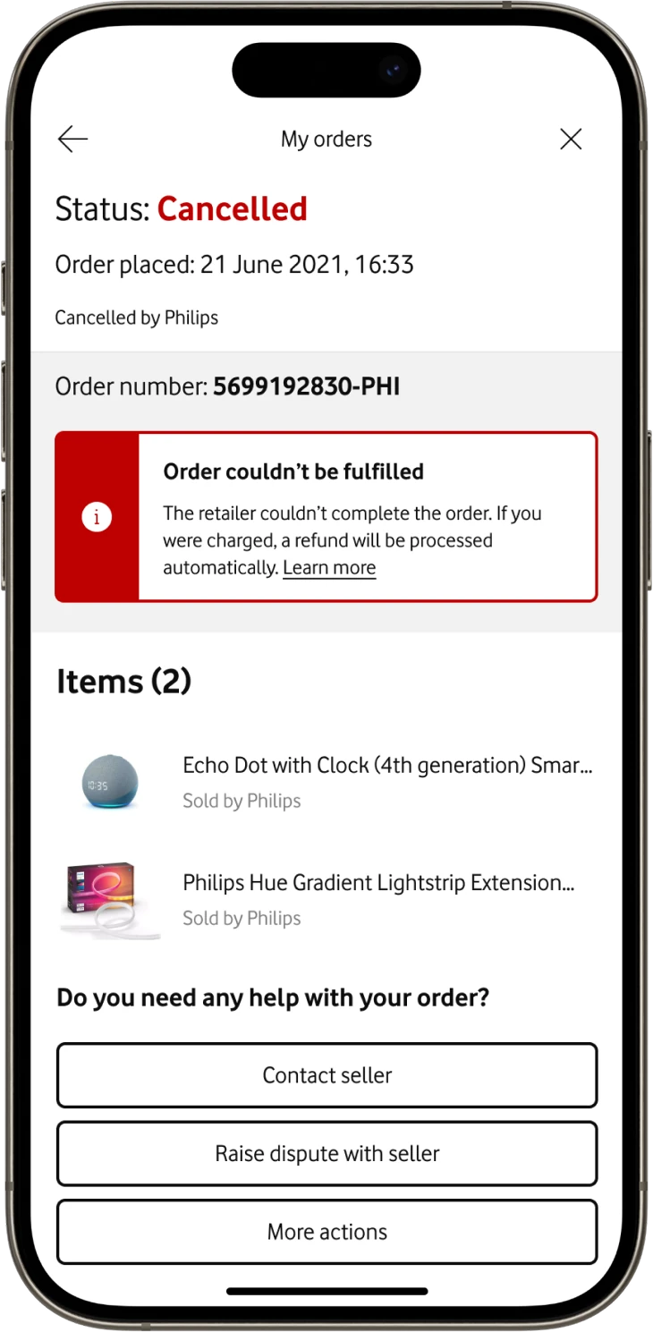
Designing for failures we don't own.

Partners kept stock and support details in our CMS. When they couldn't fulfil an order, the fault was theirs, but it happened inside our app.

  1. What went wrong, in plain words
  2. Who is responsible for fixing it
  3. What happens next, and when
Order cancelled by Philips, with refund message
01Cancelled by the seller
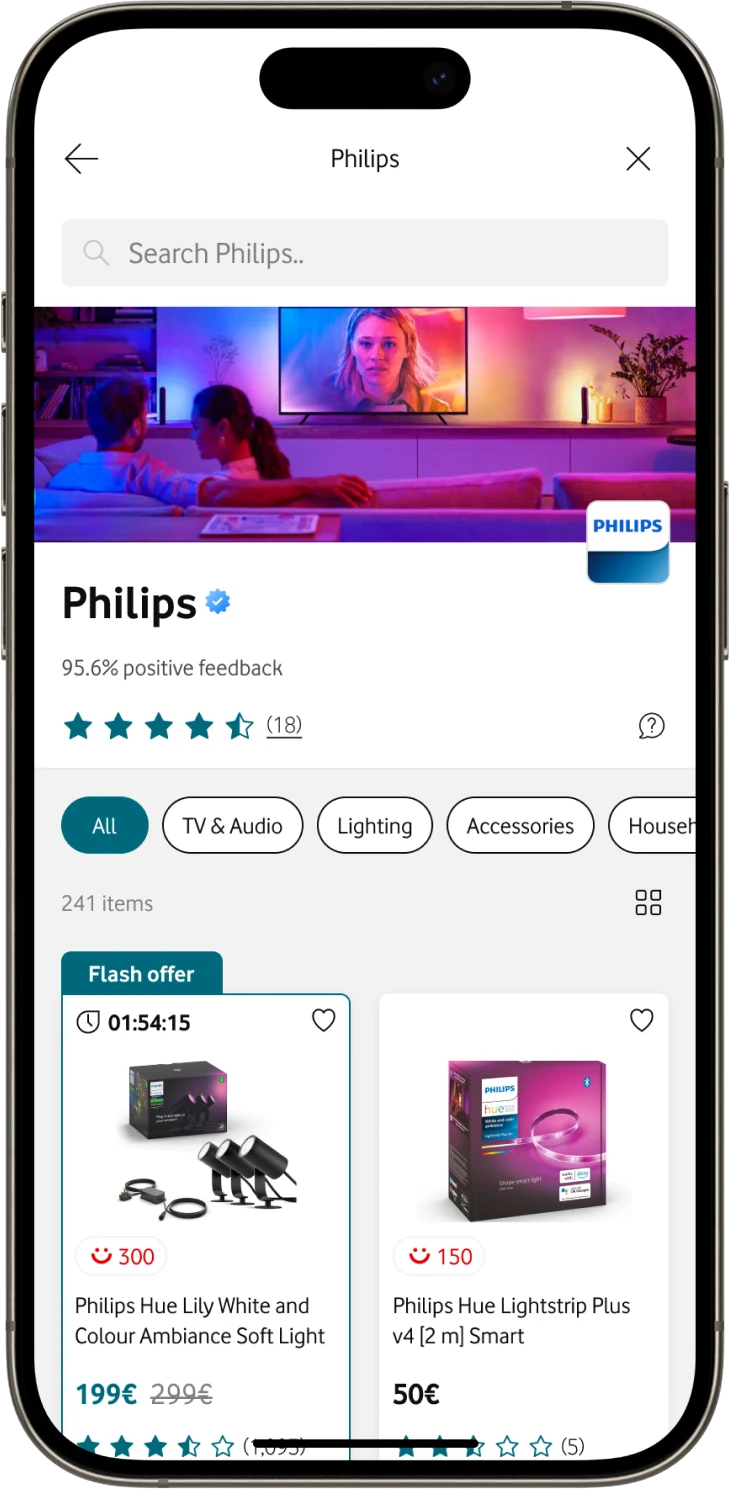
Philips seller storefront
02Who sold it
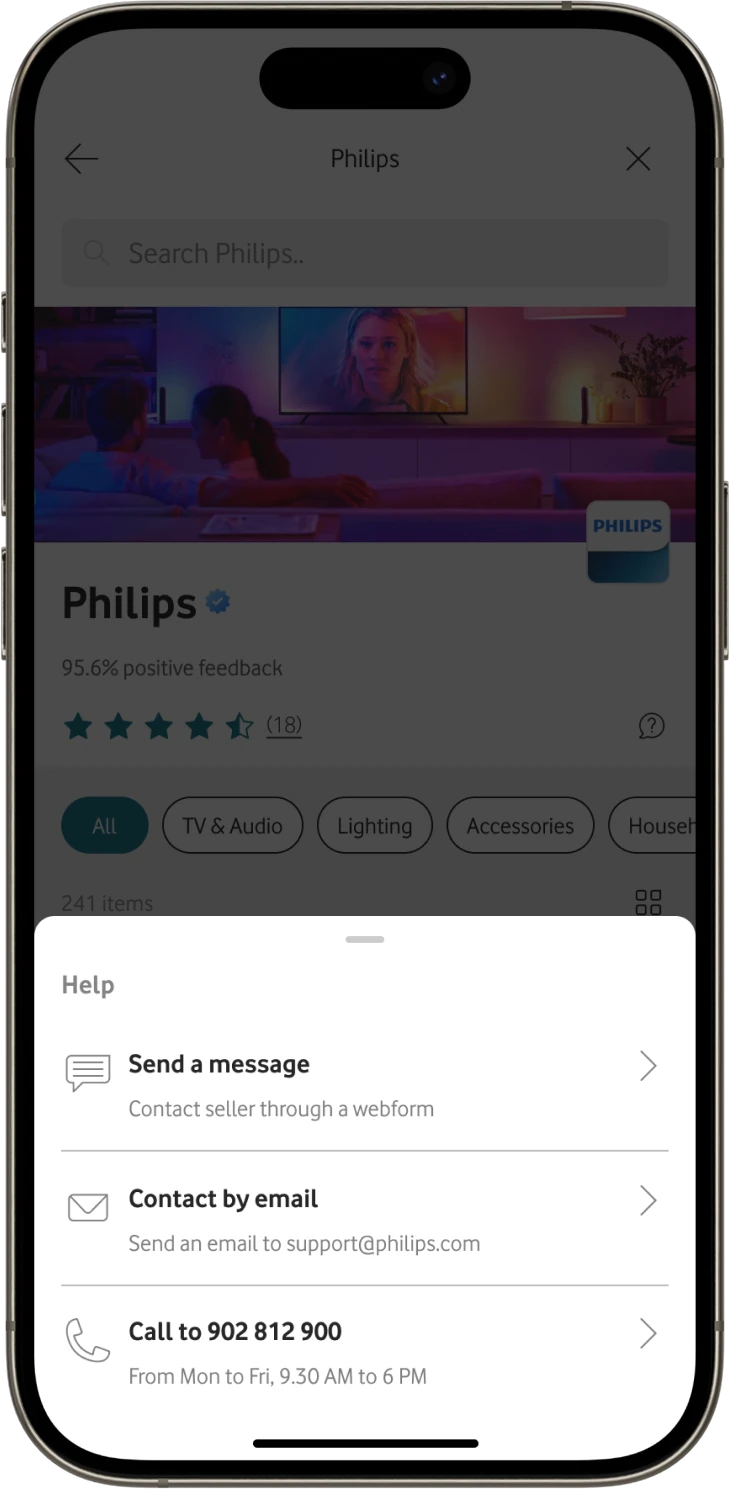
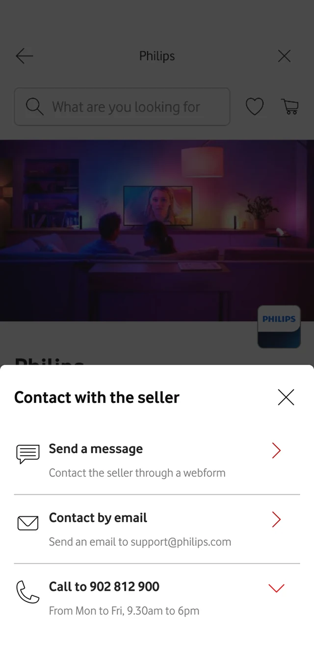
Help sheet to contact the seller
03How to reach them
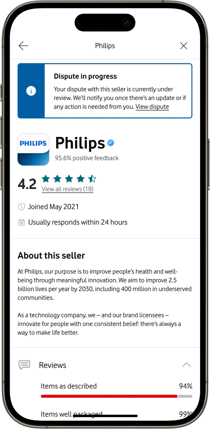
Dispute in progress banner on the seller page
04Dispute tracked
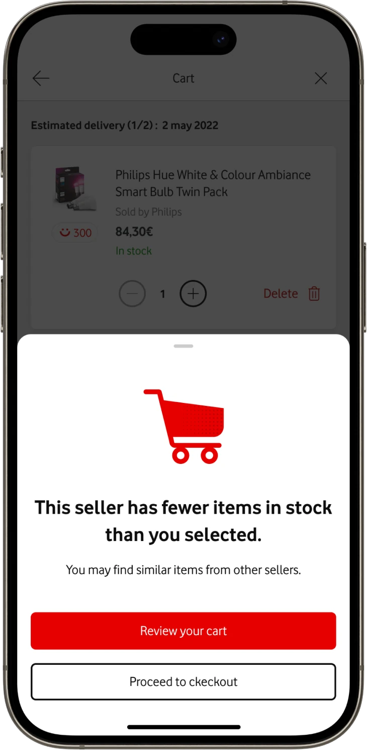
Seller has fewer items in stock than selected
01Fewer in stock than chosen
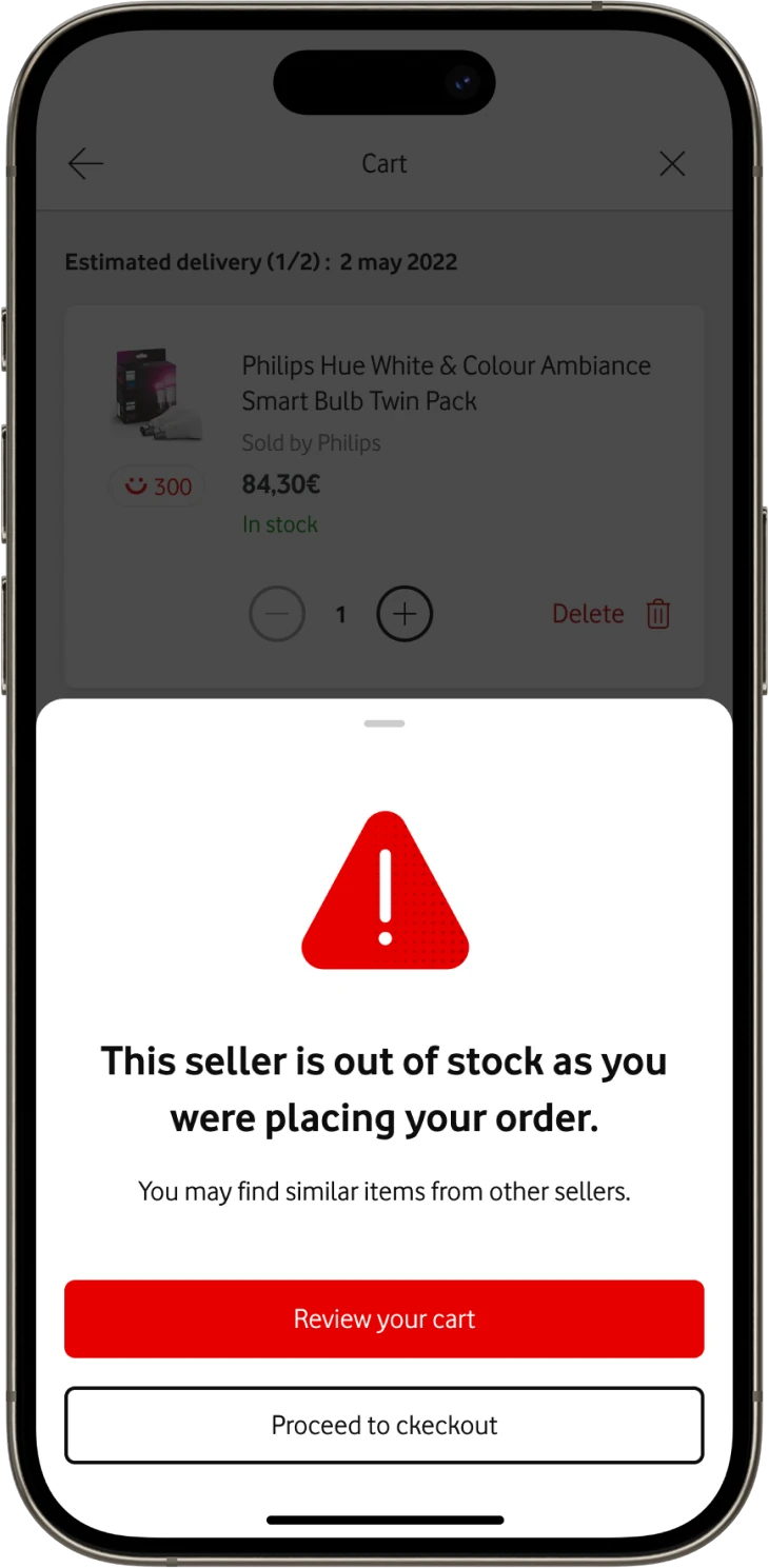
Seller ran out of stock while ordering
02Sold out mid-order
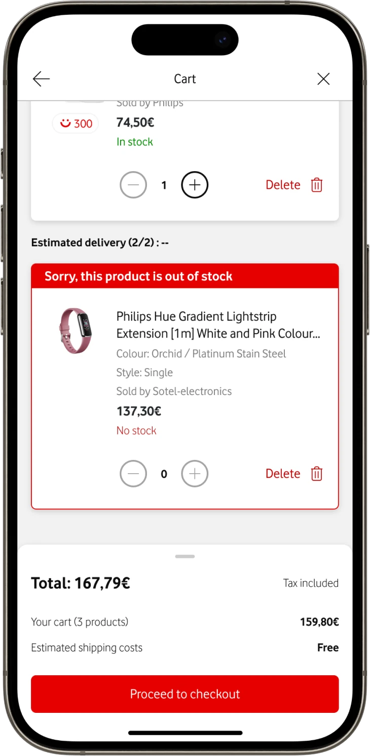
Out of stock item flagged in the cart
03Flagged in the cart
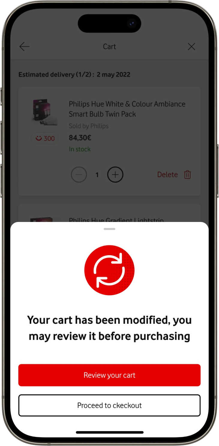
Your cart has been modified sheet
01Cart changed before paying
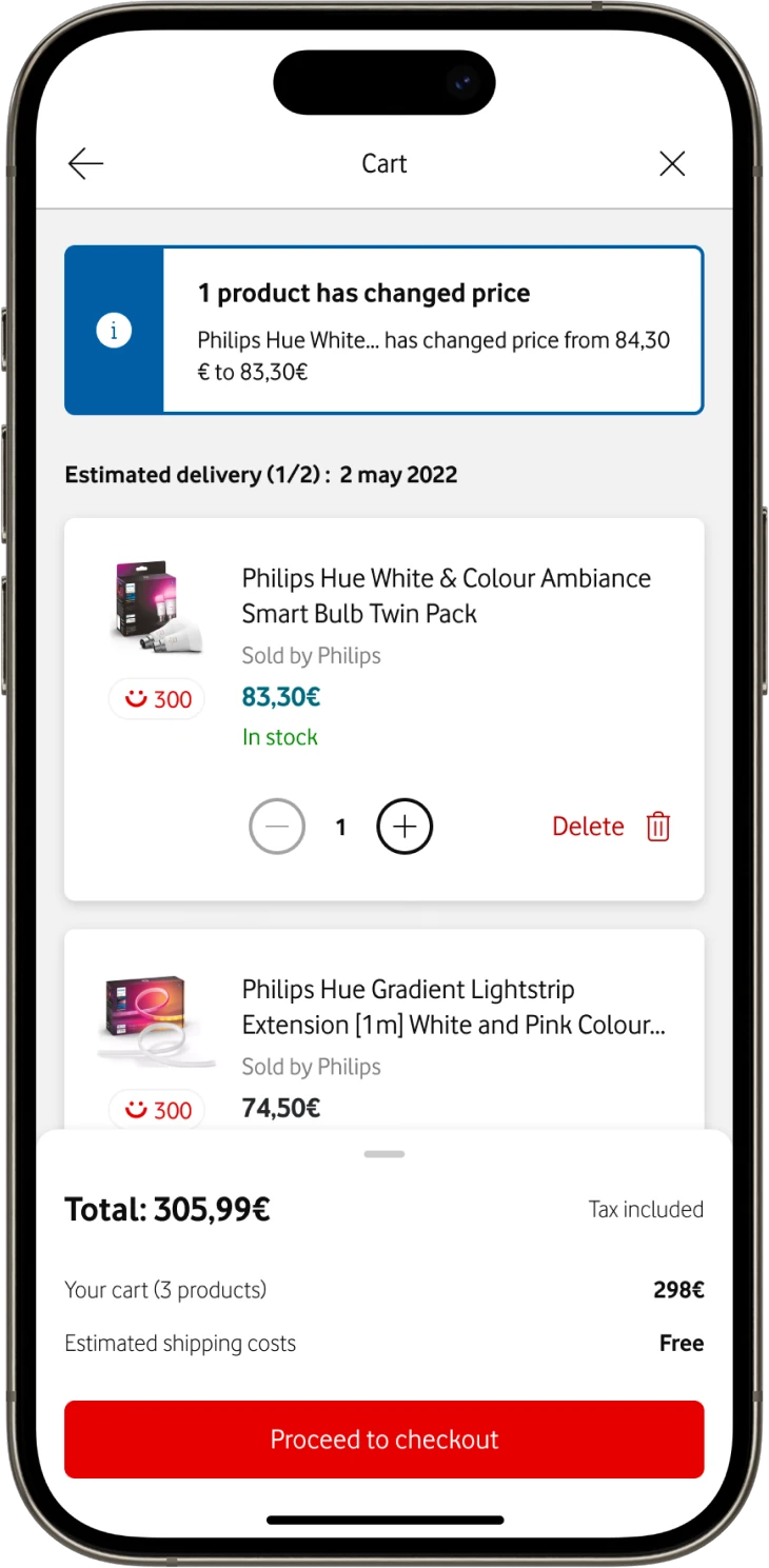
Price change banner in the cart
02What changed, and by how much
Trade-off · Delivery pressure

Mid-build, native payment fell through. Three ways forward.

The legacy payment integration couldn't support it without deeper re-architecture. Half the room wanted to cut scope, half wanted to wait.

ACut Marketplace scope

Build native payment, launch a thinner shop.

Losing core Marketplace hurt more than a temporary redirect.
BDelay the launch

Keep everything, ship when payment is ready.

No fix date in sight, so the launch would slip indefinitely.
CShip full scope, pay in an in-app browser

Use the stable web payment for now.

Our pick. Launched on time, full scope.
Shop
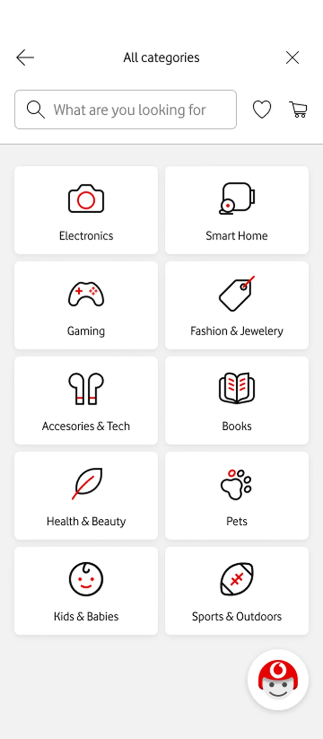
All categories
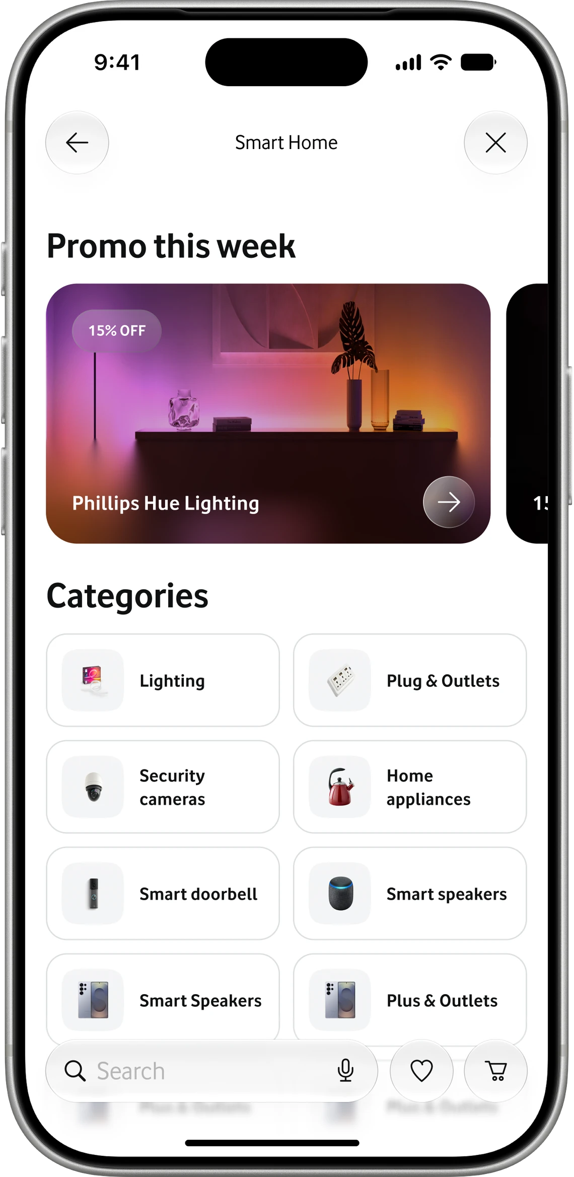
Smart Home category
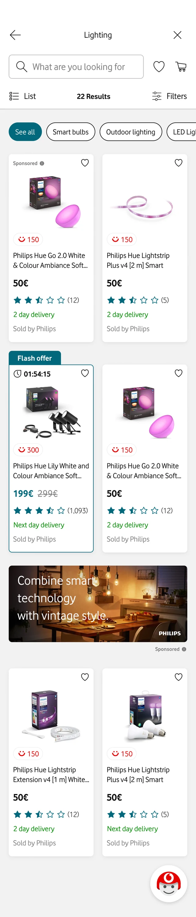
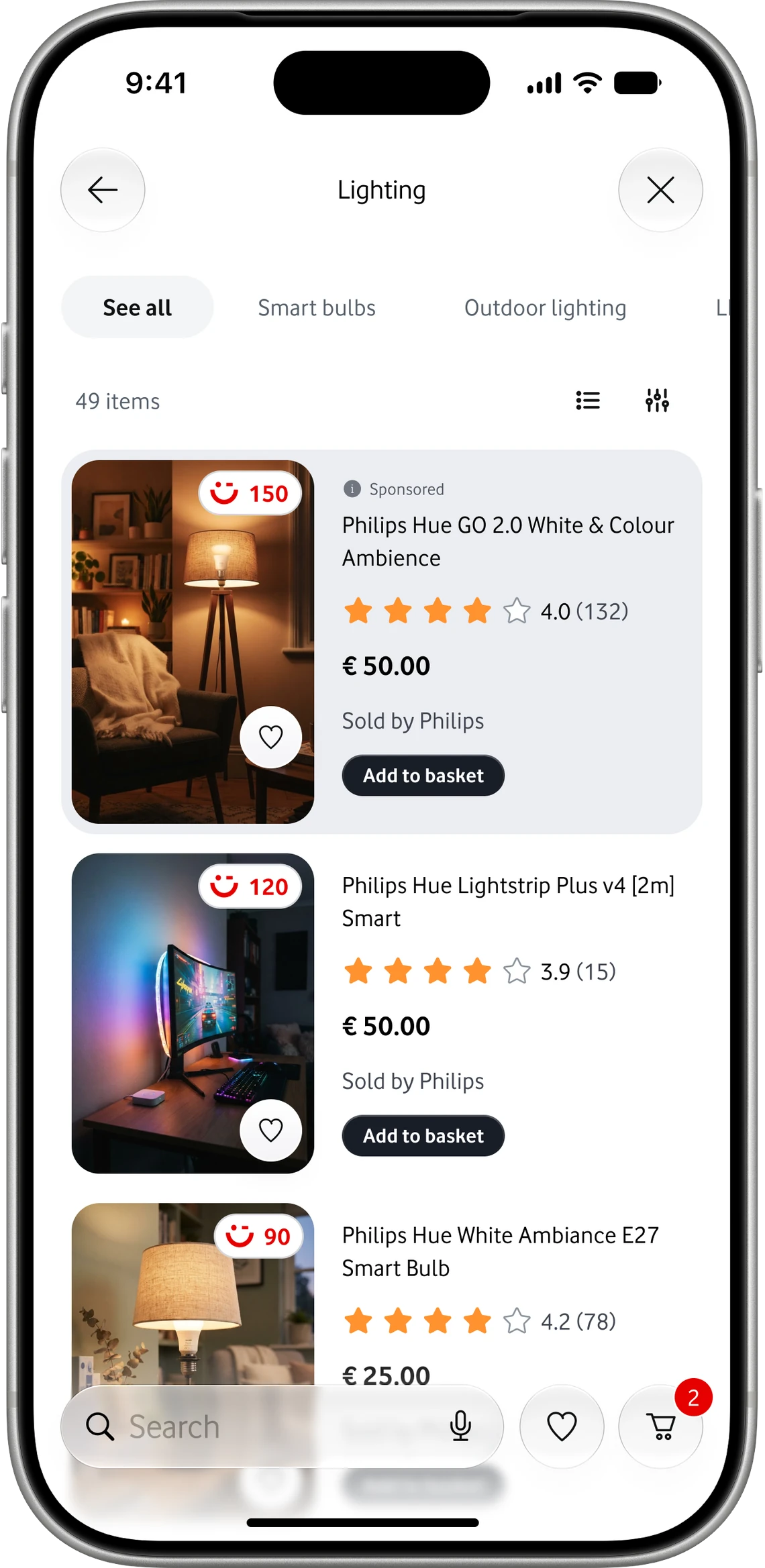
Lighting category
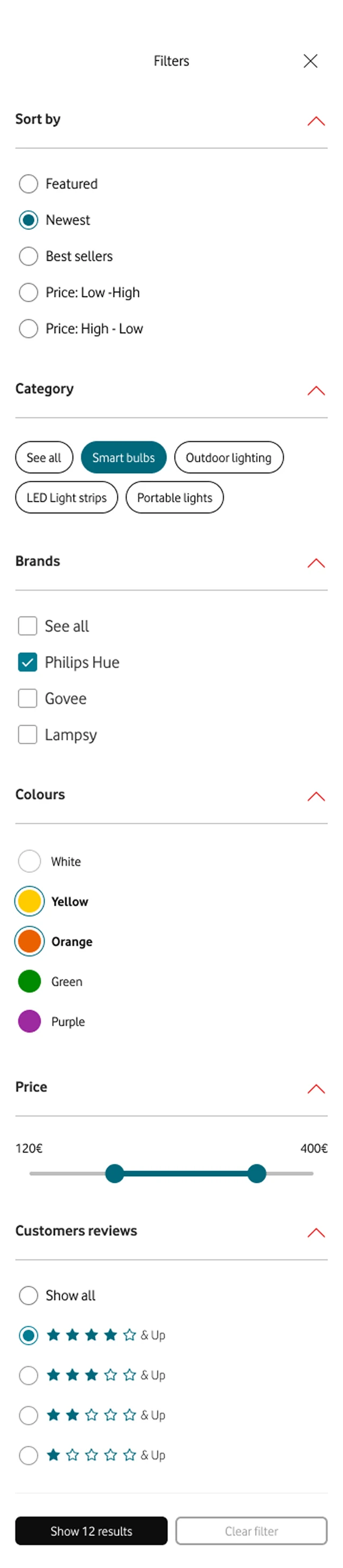
Filters
Philips store
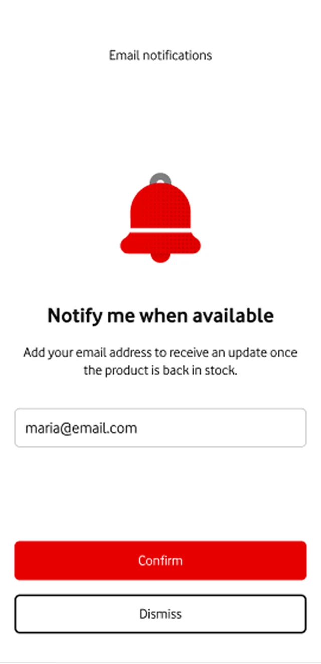
Notify me when available
Added to cart
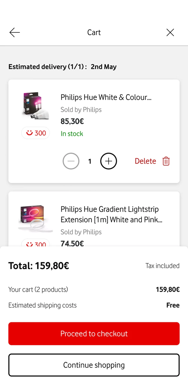
Cart
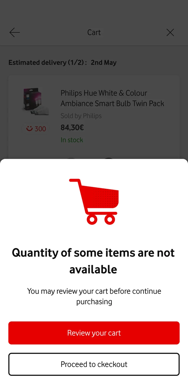
Quantity not available
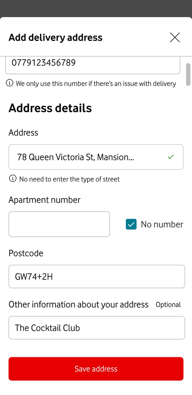
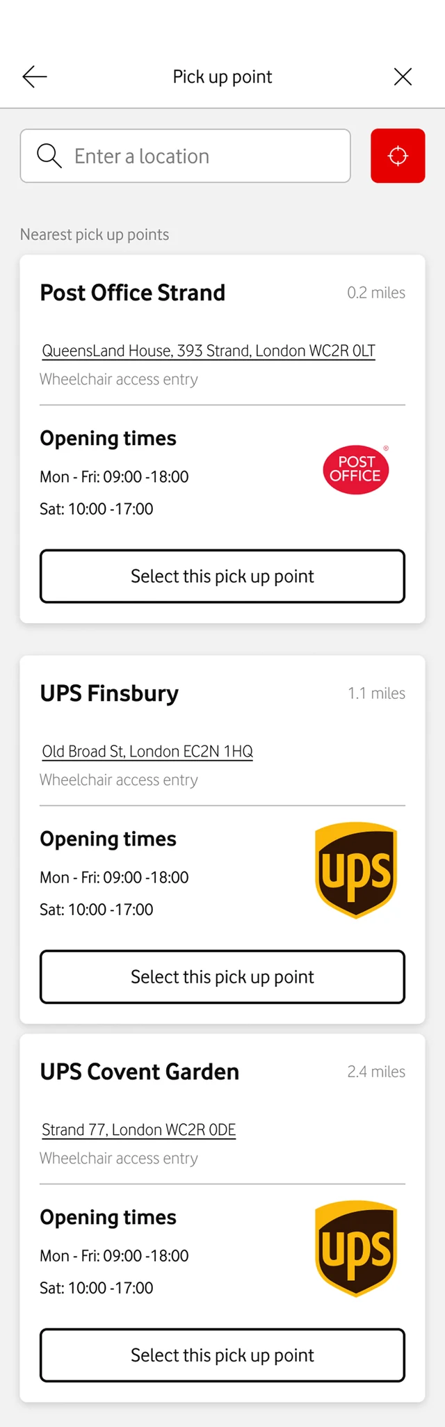
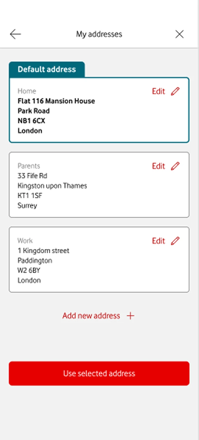
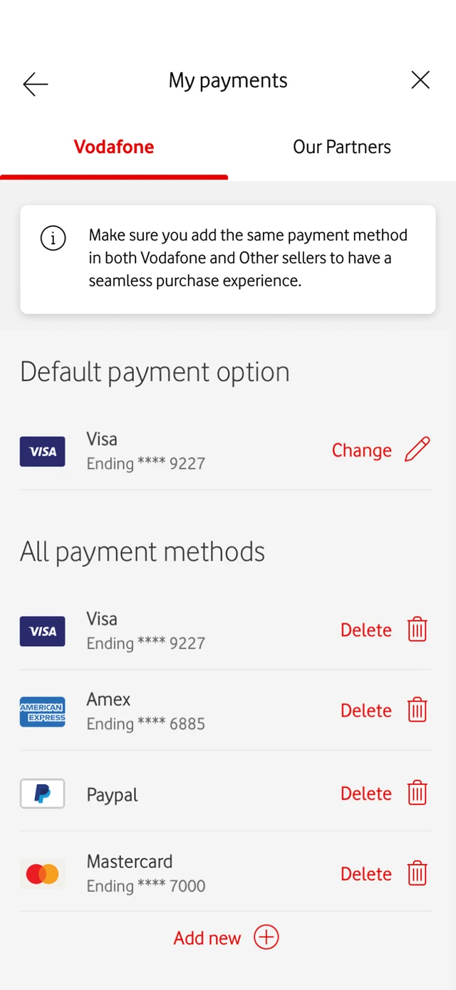
Delivery and checkout
Add delivery address
Pick up point
My addresses
My payments, Vodafone
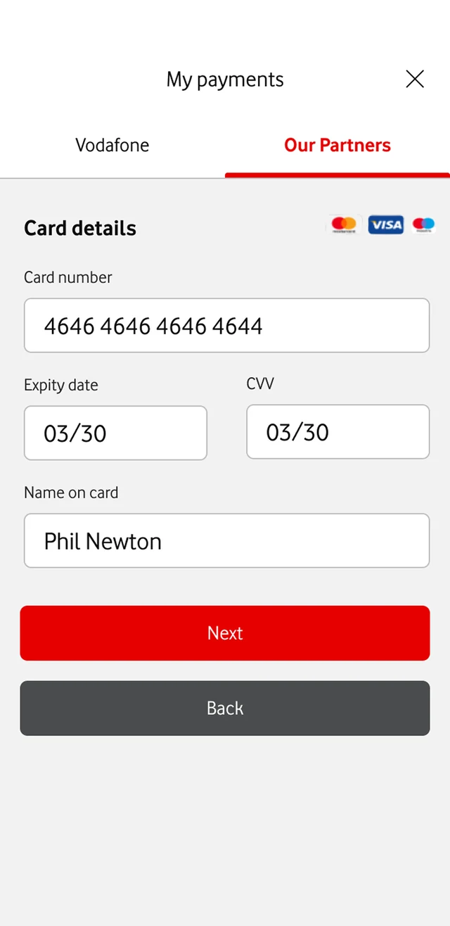
My payments, card details
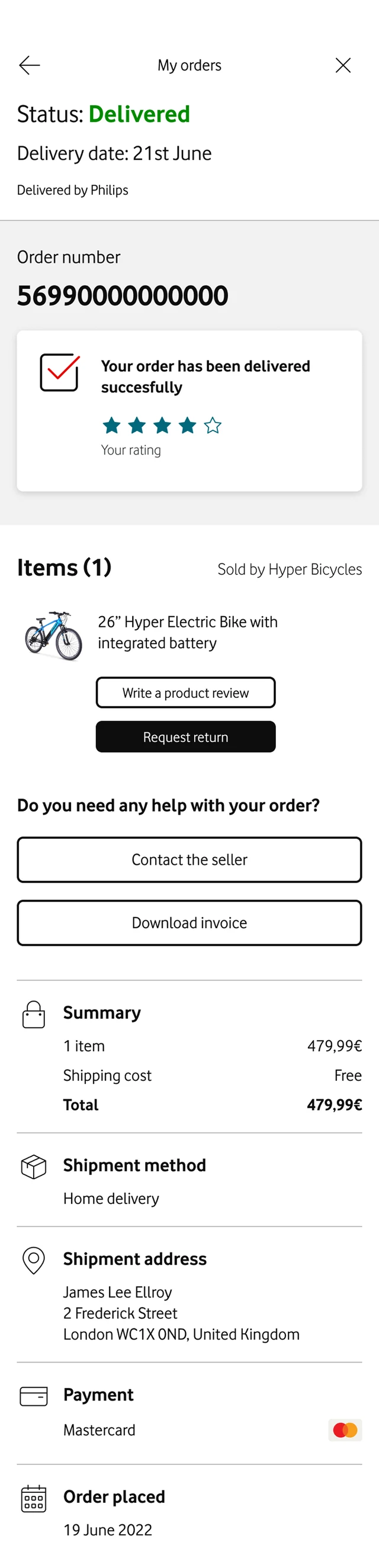
My orders
Contact the seller
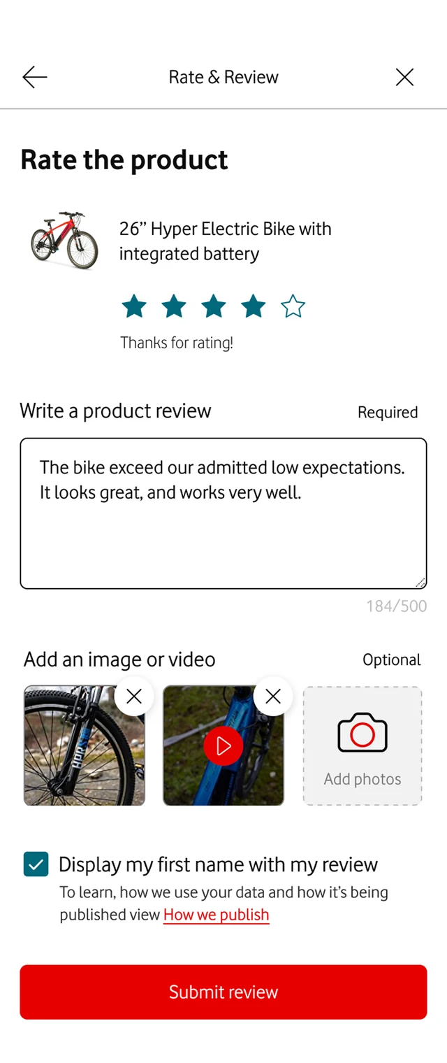
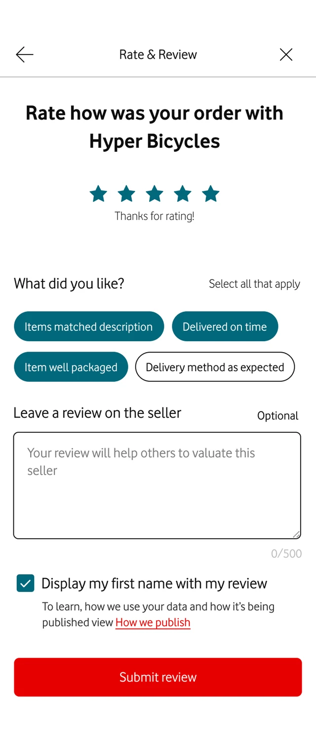
Rate the product
Rate the seller
Engagement · Rewards

Giving people a reason to come back.

Rewards existed, but fewer than 10% engaged with it. I proposed small games with different rhythms.

  • Instant: tap to reveal, spin, dice, scratch card
  • Memory: match the cards
  • Streak: collect a letter a day to spell a prize
+32%

engagement with Rewards, plus more frequent app visits

Outcomes

What changed for the app.

+80%

average session length in the first year. Some of it is novelty; we're watching whether it holds.

>50%

less engineering time spent on maintenance, combined across markets

6

markets live on MVA12: Italy, Ireland, Portugal, Spain, Albania, Türkiye

In testing, people saw Marketplace as a perk of being a customer, not an Amazon competitor.

Task success across browsing, product and payment was very high, because it behaved like shops people already knew.

Retrospective

You can do it right and still not get the ending you planned.

The late-2023 downturn hit. Partners paused, inflation cut demand, and Vodafone sold its Italian and Spanish businesses. Marketplace launched only where demand held.

What I'd do differently

Bring legal and compliance in from the first flow, not after it.

Our first checkout was drawn without payment regulation in mind. PSD2 and PCI DSS only shaped it after review. Collaboration outside the product team matters as much as inside it.

Then → now

The same journeys, in Unity.

Vodafone's new design system, 2024–2026. First, the showreel we made for its launch.

Unity design system

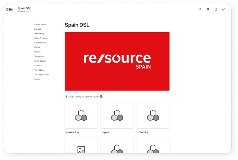
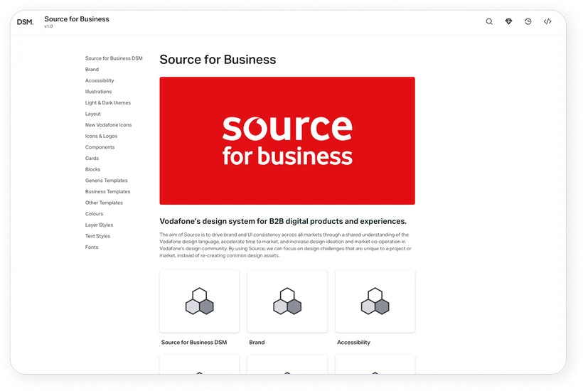
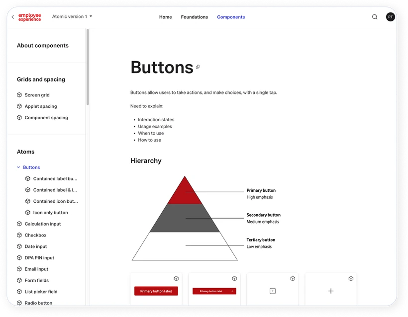
Ten markets, ten design systems.

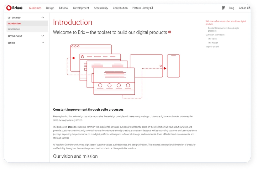
Germany had Brix, the UK and Ireland had Source, Spain had Resource, Hungary had Aurora. Patterns drifted, and every team rebuilt the same button.

BrixSourceResourceAurora+6 more Unity

One system for every market. Hence the name.

My part: components, icons, illustrations, and the accessibility process towards the 2025 EAA.
Redesign · drag to compare

Marketplace, redrawn in Unity.
2023 Smart Home shop screen
Smart Home shop screen redrawn in Unity
2023 · Source2026 · Unity
2023 Lighting category screen
Lighting category screen redrawn in Unity
2023 · Source2026 · Unity
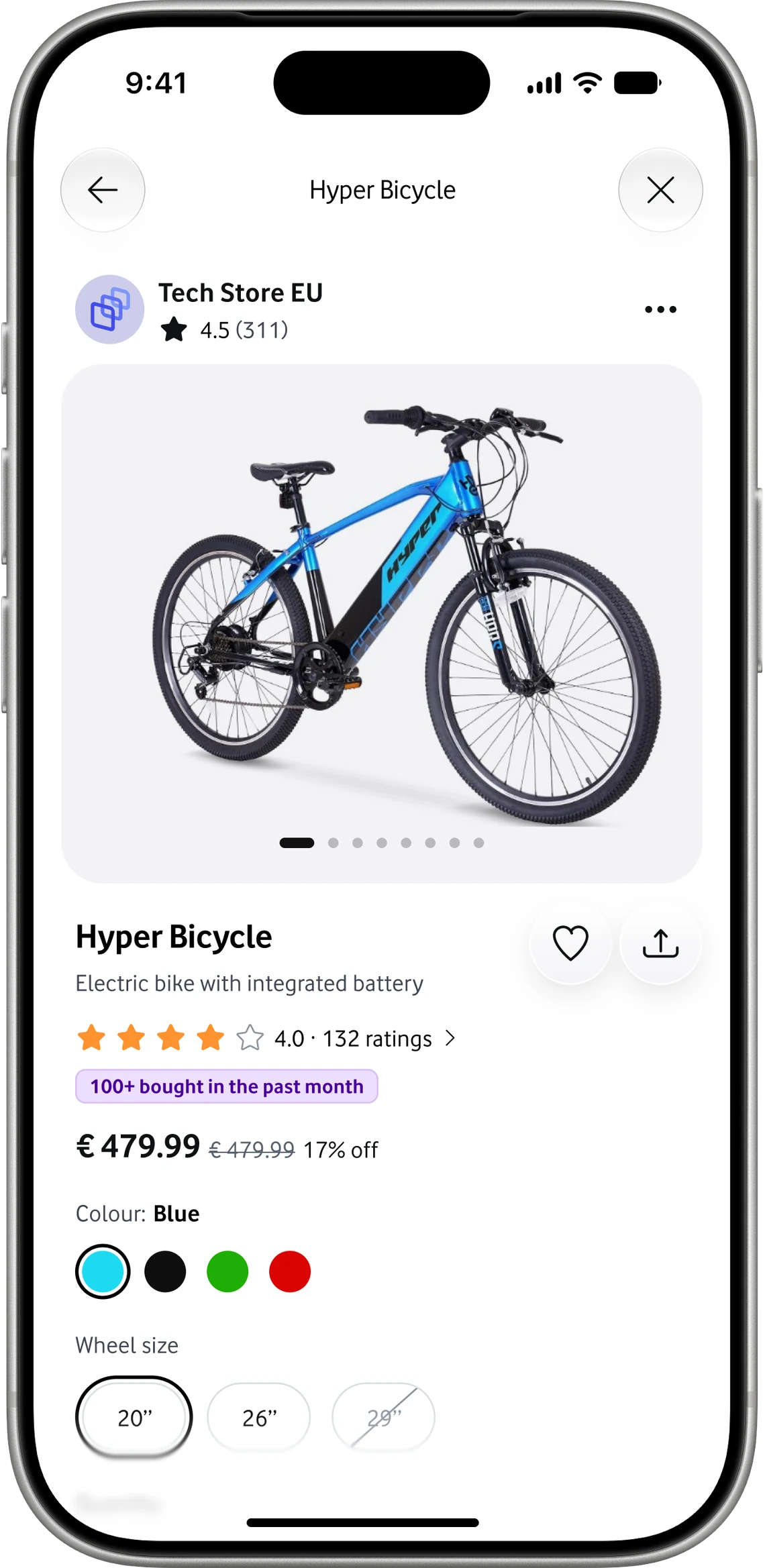
2023 Product page screen
Product page screen redrawn in Unity
2023 · Source2026 · Unity

Same structure and decisions. New type, spacing, colour and components.


Designed in Unity. It reached the live app after I left Vodafone, so these are my redesigns, not shipped screens.

Unity · Outcomes

One system, measurably better.

30%

performance improvement, with less design debt

33%

better Customer Effort Score

200+

custom illustrations

EAA

compliance for the 2025 European Accessibility Act

On accessibility I set up audits with specialist agencies, worked with legal, taught developers what accessible build means, and wrote the process and guidelines the company now uses.

Case study · Side project, iOS and Android

AnyTracker

A tracking app two of us built on nights and weekends, and grew with £0 on ads.
Role
Co-founder and sole designer
Team
Me and Shervin Koushan, an engineer in Norway
Scope
Research, product, UI, App Store, marketing, some front-end
When
Mid 2022 to end of 2025
The problem

"50% off", and still more than I paid three months ago.

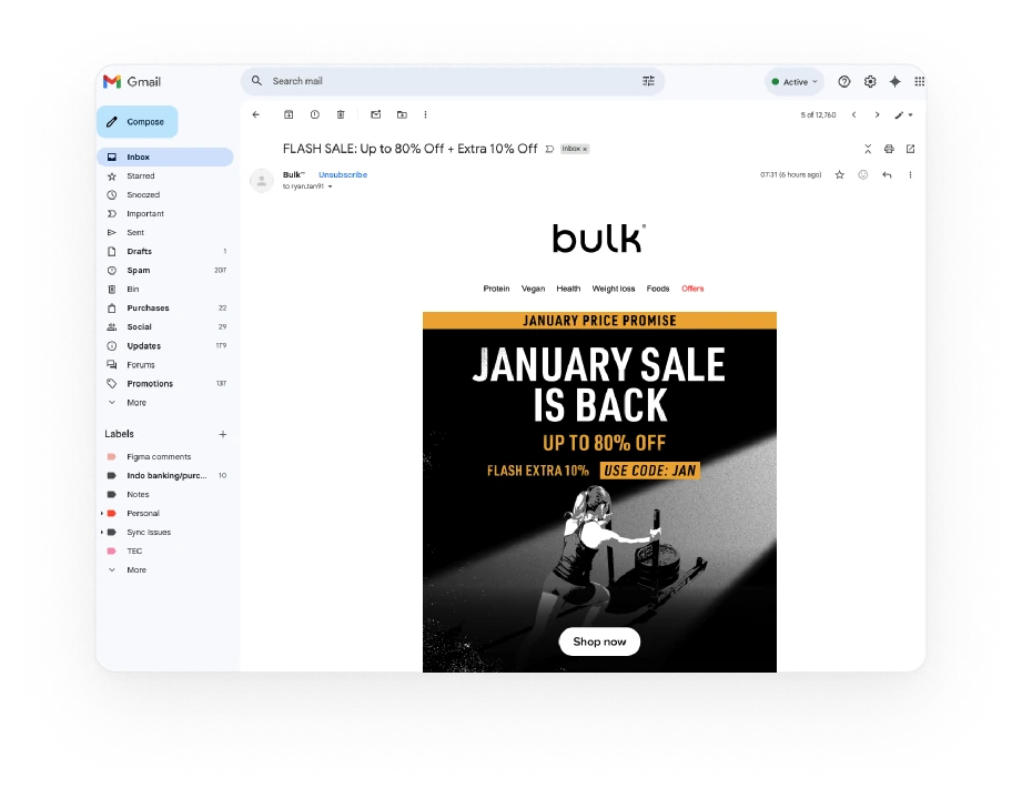
During Covid, prices rose far faster than the discounts. And the inbox didn't help.

46

sale emails in January alone. None told me when to buy.
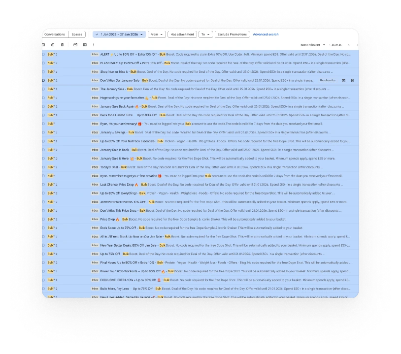
An inbox full of sale emails from one retailer A 'January sale is back, up to 80% off' email
Research · Friends and family, meetups, Reddit

People arrived mid-purchase. If the first track failed, they deleted the app.

They weren't exploring. They wanted a fast answer to one question: did it work?

£55 Buy Get It worked It didn't Deleted, no retry 01Mid-purchase 02Installs to check one item 03First try decides
Hardest problem · Reliability

Don't ask people to set up a scraper.

Websites change constantly, so rigid scrapers break. We built change detection instead: point at what matters, get told when it changes.

  • Reliable over precise. Keep working without babysitting.
  • Any meaningful change. Price, stock, wording.
  • Fewer decisions. No rules or logic to configure.

Inside, a change tracker. Outside, a price tracker, because that's who would pay.
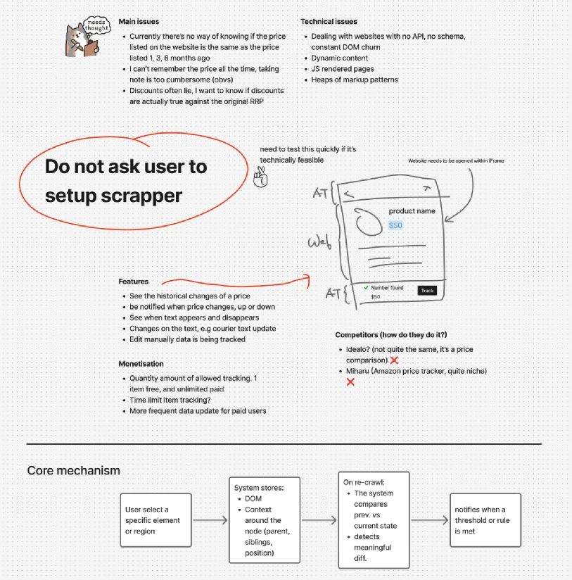
Early sketch: 'Do not ask user to set up scraper', with the core mechanism diagram
Validation

I tested demand. Shervin tested feasibility.

Before building properly, a landing page asked one question: can we explain this well enough for someone to leave their email?

~200

waitlist sign-ups. Not viral, but enough signal.

A lifetime price for early sign-ups: a thank-you, and a reason to commit.
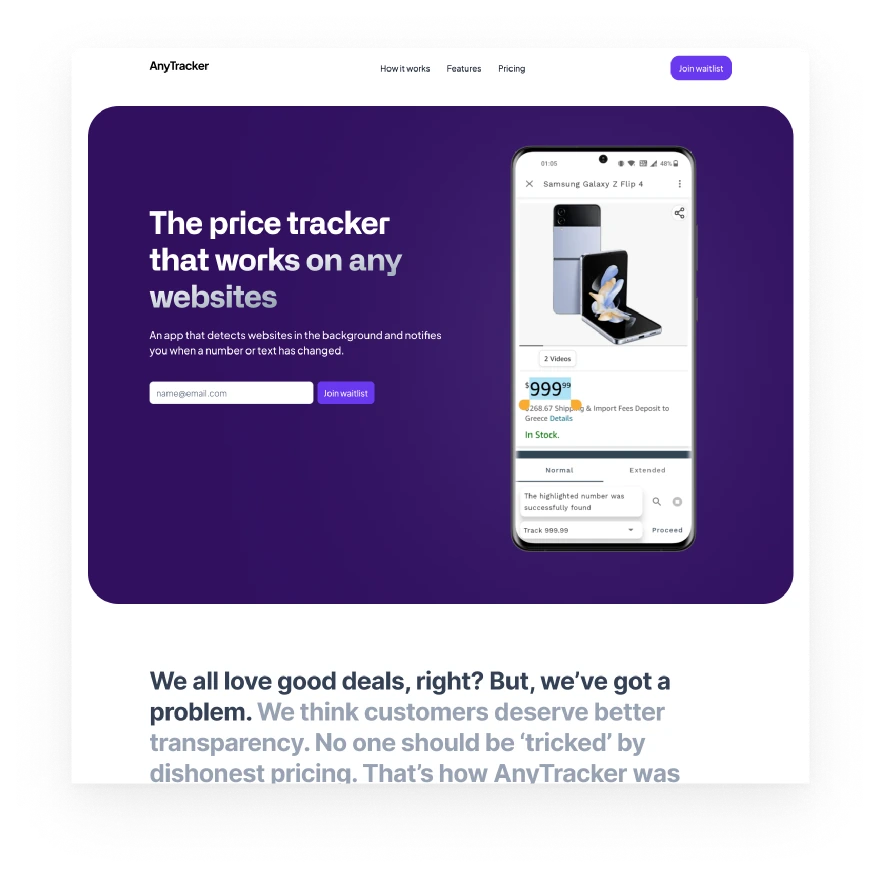
AnyTracker landing page: 'The price tracker that works on any websites', with a waitlist form
MineLanding page and waitlist
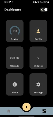
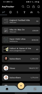
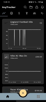
Prototype dashboardPrototype list of tracked itemsPrototype price chart
Shervin'sA rough build, to prove it works
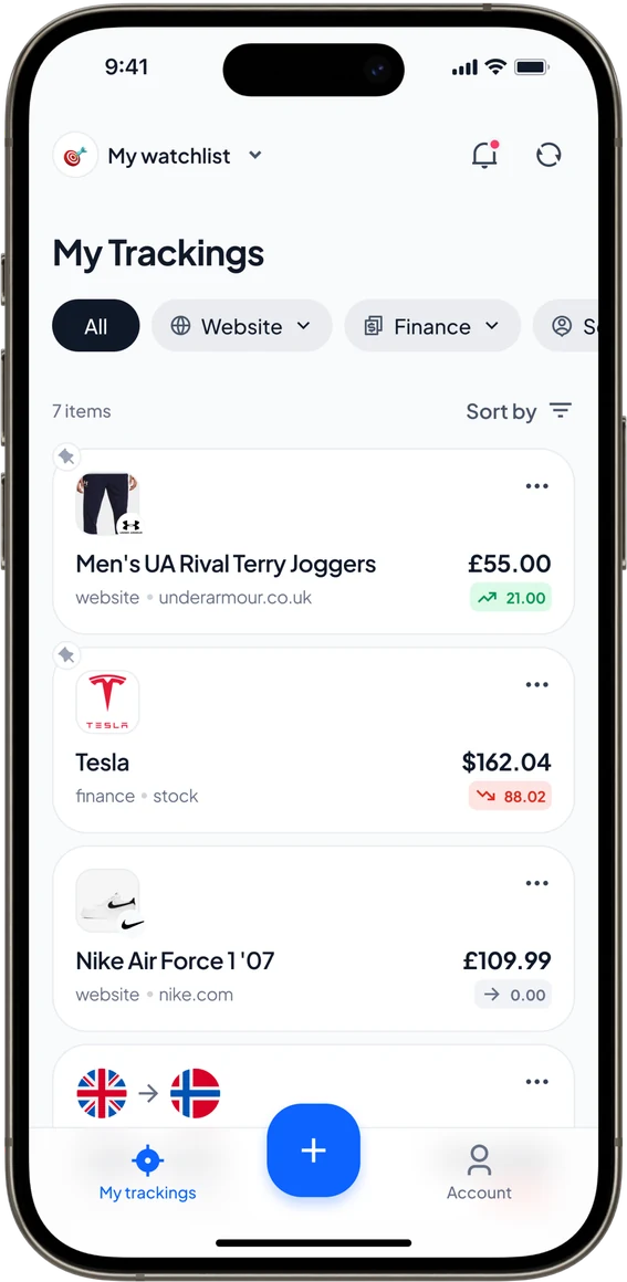
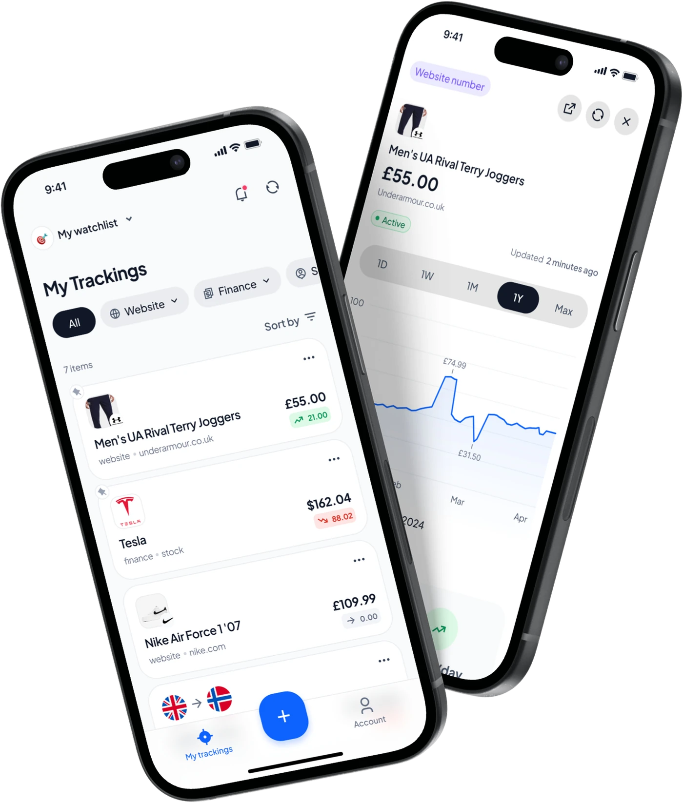
My trackings home
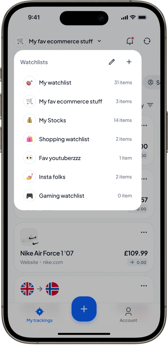
Switching watchlists
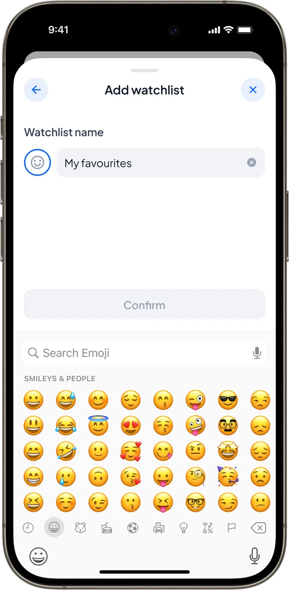
Adding a watchlist
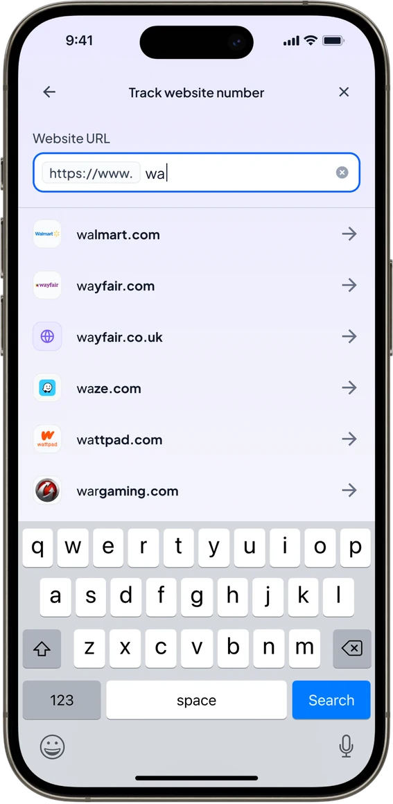
Tracking a website by URL
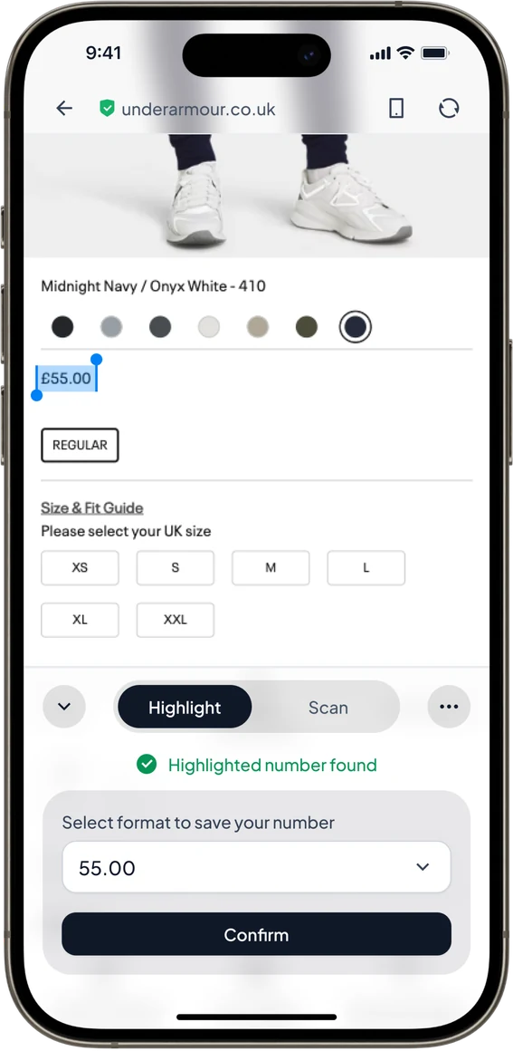
Highlighting a price on a live page
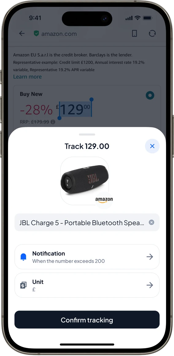
Confirming a tracked Amazon price
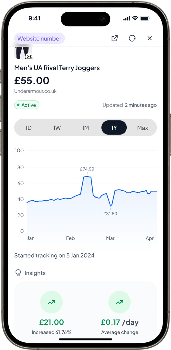
Price history chart
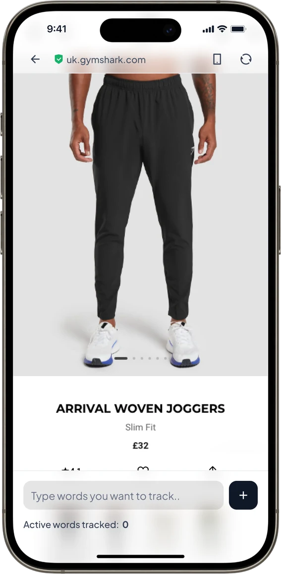
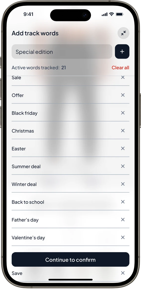
Tracking words on a page
Tracked words list
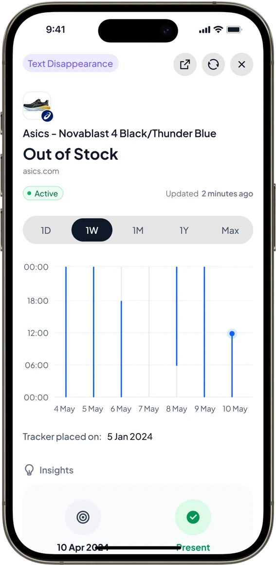
Out of stock tracker
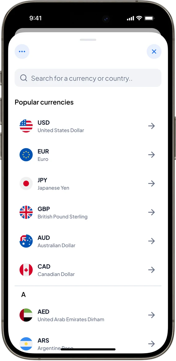
Choosing a currency
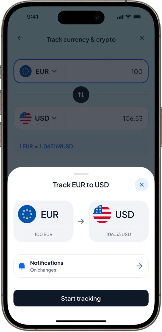
Tracking EUR to USD
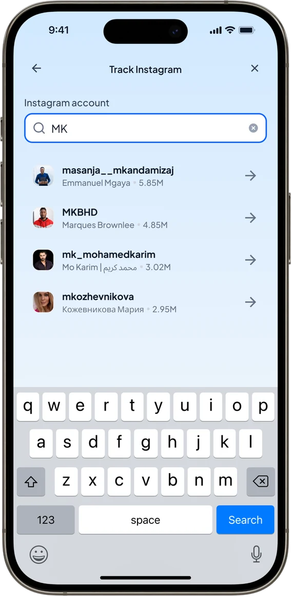
Tracking an Instagram account
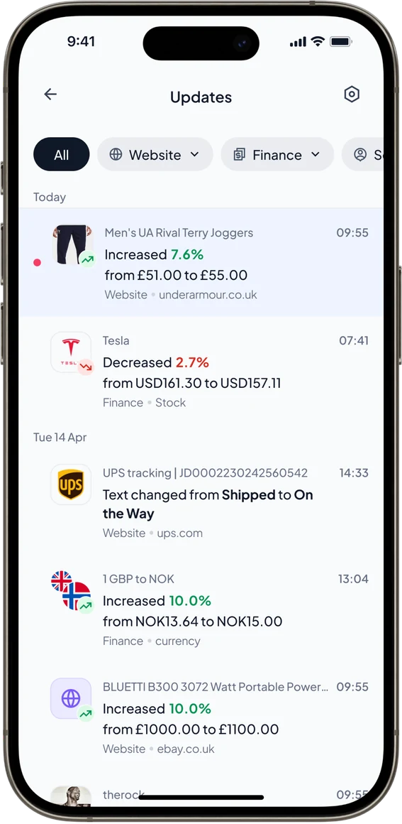
Updates feed
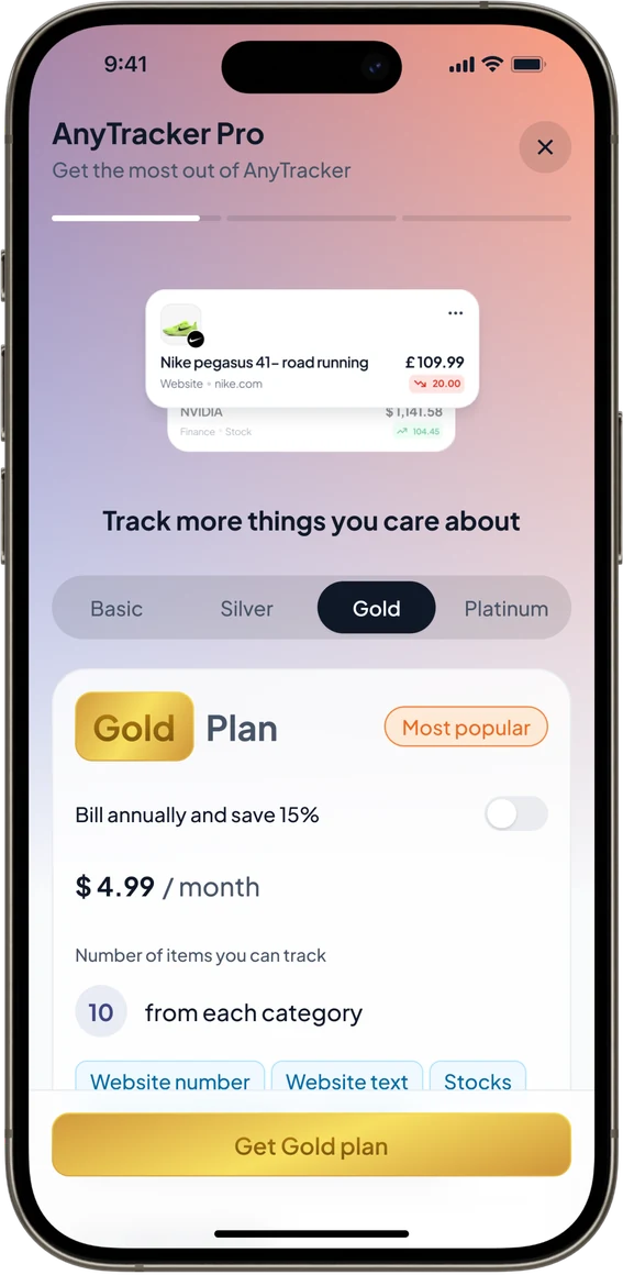
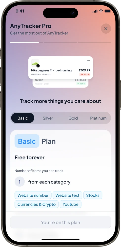
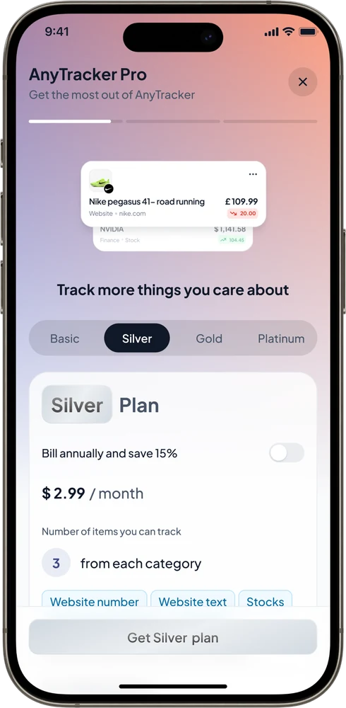
AnyTracker Pro paywall
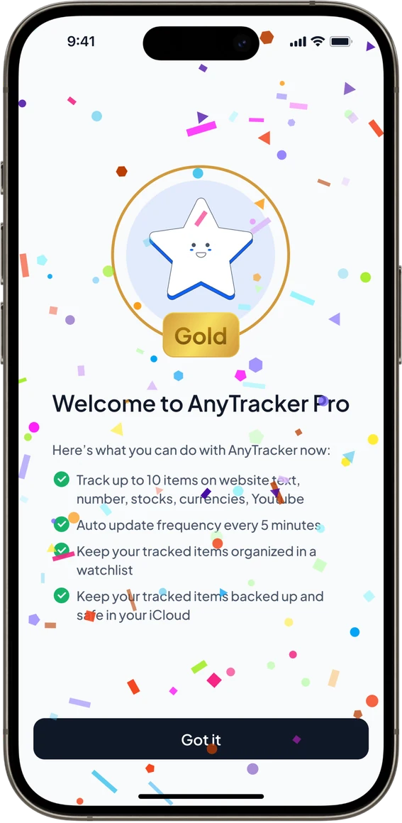
Welcome to Pro
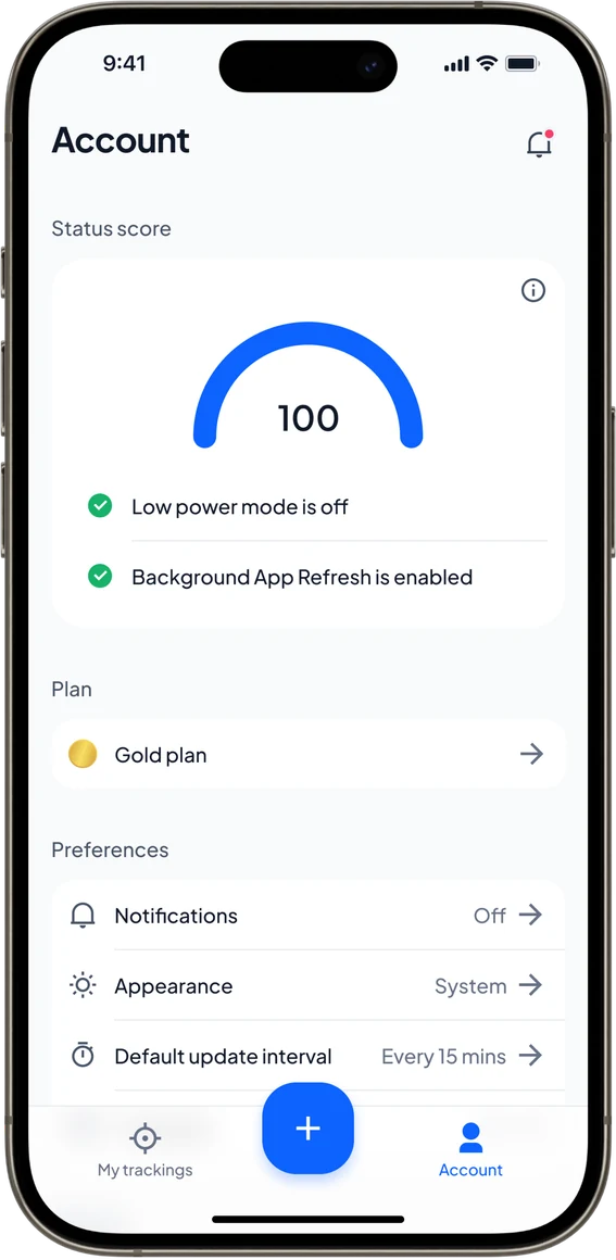
Account and status score
The app · iOS and Android

Any web page to a tracked item, in a few taps.

Paste a link or share from the browser, tap the price on the live page, and the app watches it from then on.

After launch · Growth experiments

No marketing team, so I ran the experiments.

I kept testing beyond the screens: how the store page sells the app, and when to ask people to pay.

+4%

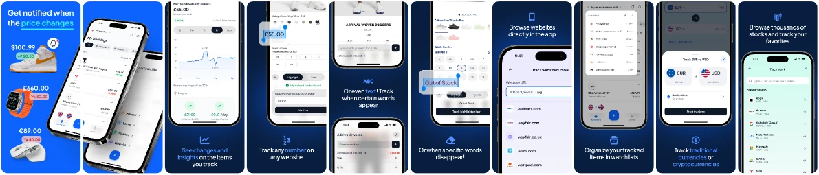
conversion with plain App Store screenshots

+25%

subscribers with the paywall after onboarding
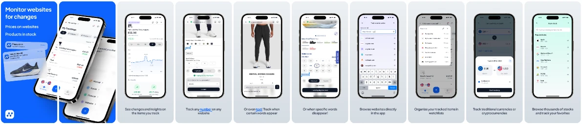
A · PlainWon · +4%
Version A: plain App Store screenshots on light grey
B · Bold
Version B: bold App Store screenshots on dark blue
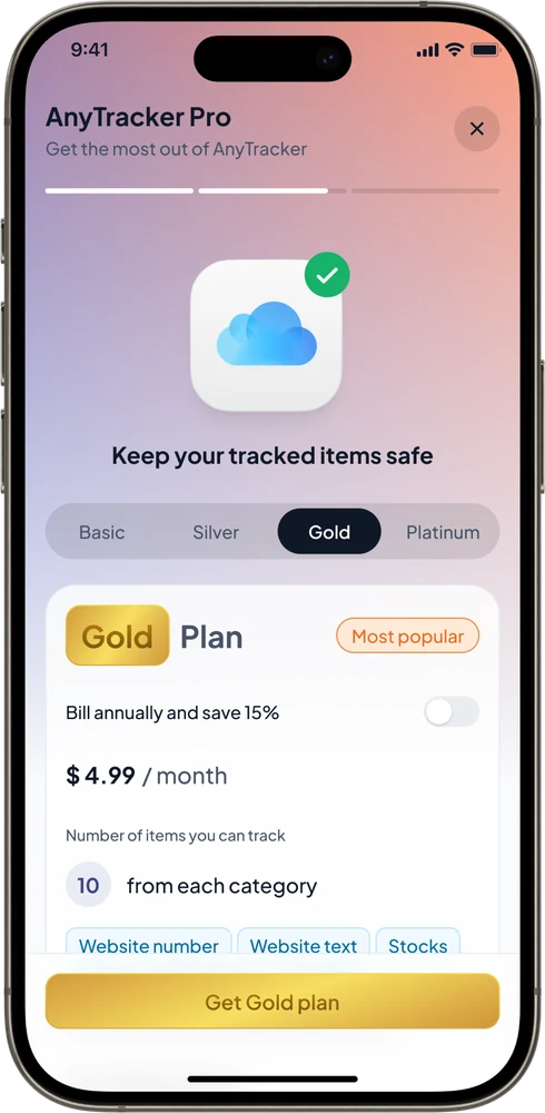
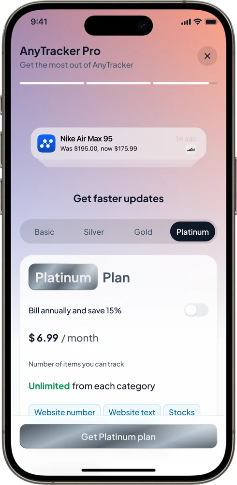
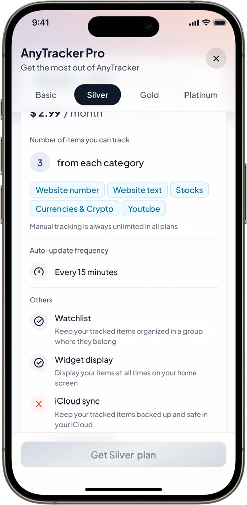
Paywall, Basic plan: free forever, 1 item per categoryPaywall, Silver plan: $2.99 a month, 3 items per categoryPaywall, Gold plan, most popular: $4.99 a month, 10 items per categoryPaywall, Platinum plan: $6.99 a month, unlimited itemsSilver plan details: update frequency, watchlists, widgets, iCloud sync
Growth · Community

No ad budget. People did the talking.

  • Reddit first. Posts about the problem, and the design, travelled.
  • A public feedback board, Discord and Telegram. Users watched their ideas ship.
  • Viral in Argentina, then Türkiye, where high inflation made it essential.
£0

spent on ads

200K+

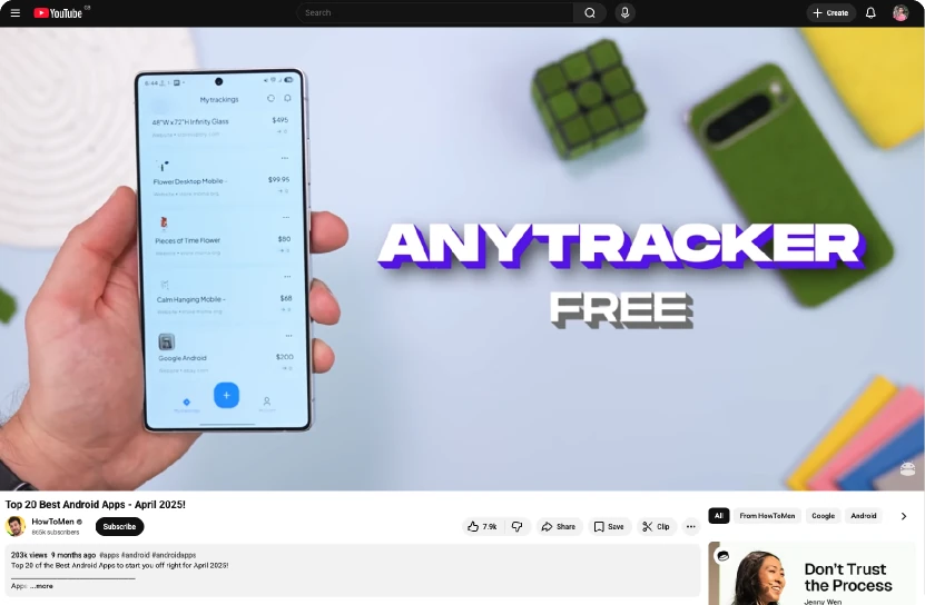
views on one YouTube feature

AnyTracker featured in a YouTube video on top Android apps Reddit comments praising AnyTracker's design
Hardest call

Android requests arrived every day. We said not yet.

The hard part wasn't the UI. It was tracking reliably across thousands of websites. Two platforms would have halved our speed on the thing that mattered.

iOS became our test bed. When Android launched, it launched mature, on day one.
After launch · Pricing

Not everyone wants a subscription.

People kept asking to pay per item. Alongside the plans, we added pay-as-you-go tracking credits.

8–10%

of revenue by October 2025, and growing

Also after launch: Normal, Extended and Ultra tracking for tricky pages, and follower tracking that brought in creators.

Results · As of October 2025

Two people, nights and weekends, a real business.

$10K+

in App Store proceeds on iOS

3.4%

conversion rate

22K+

iOS downloads, 2023 to 2025

Android launched later and passed iOS on users, but earned less. Most of its growth was in price-sensitive markets like Türkiye, Mexico and South Africa.

Still to improve: crash rate, the number of ratings and reviews, and a 2% conversion dip since July.

How we measured

Revenue lags. We watched what comes before it.

  1. Time to first tracker
  2. Return visits to check prices
  3. Alerts that mattered, a real drop on something wanted
What I'd do differently

Start with fewer assumptions, and trust users sooner.

My first onboarding over-explained. People understood the product much faster than I expected.

In November 2025 I sold my stake, and Shervin carried on running it on his own.

Thank you

Questions?

Emailryan.dion91@gmail.com
Vodafone onboarding

Only 3% finished onboarding. It "worked", so nobody wanted to touch it.

Research showed people skimming, and a big drop at the permissions step. We made it visual, shorter, asked for permissions in context, and added a reward at the end.

+25%

completion in the A/B test, with more push opt-ins

Before
After
Up next
Elapsed00:00
Planned by end of slide00:00
Say itCue, not spoken